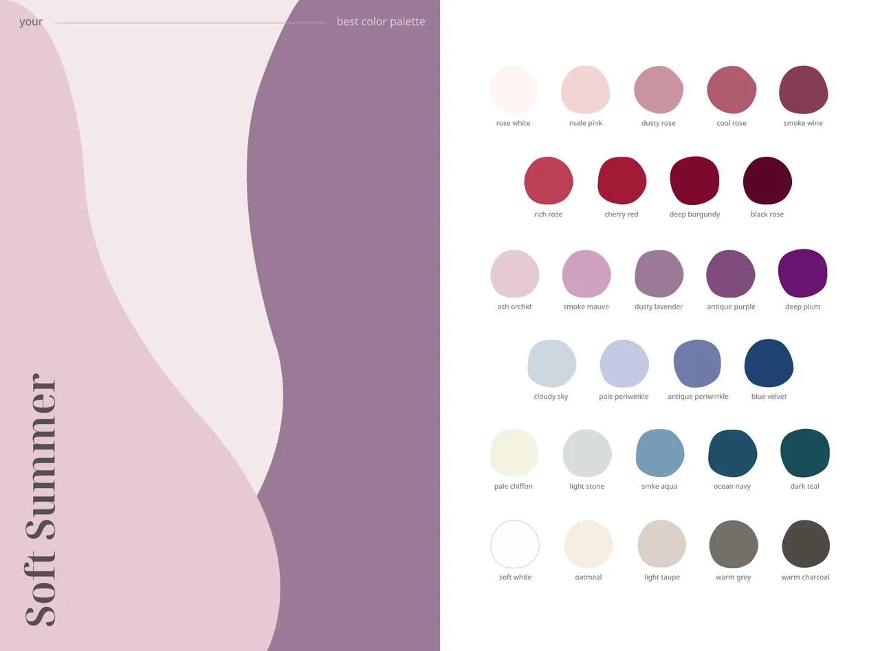
Guide to a Soft Cool Summer Color Palette after a professional color analysis in Seoul
I've always loved fashion, and before turning 30, I decided to finally get a professional color analysis done when I was visiting Seoul. I suspected certain colors didn't look great on me, but I could never figure out why. The analysis was super helpful for me and has allowed me to now let go of pieces that don't suit me, and also find ways to soften and lighten colors that aren't in my season.
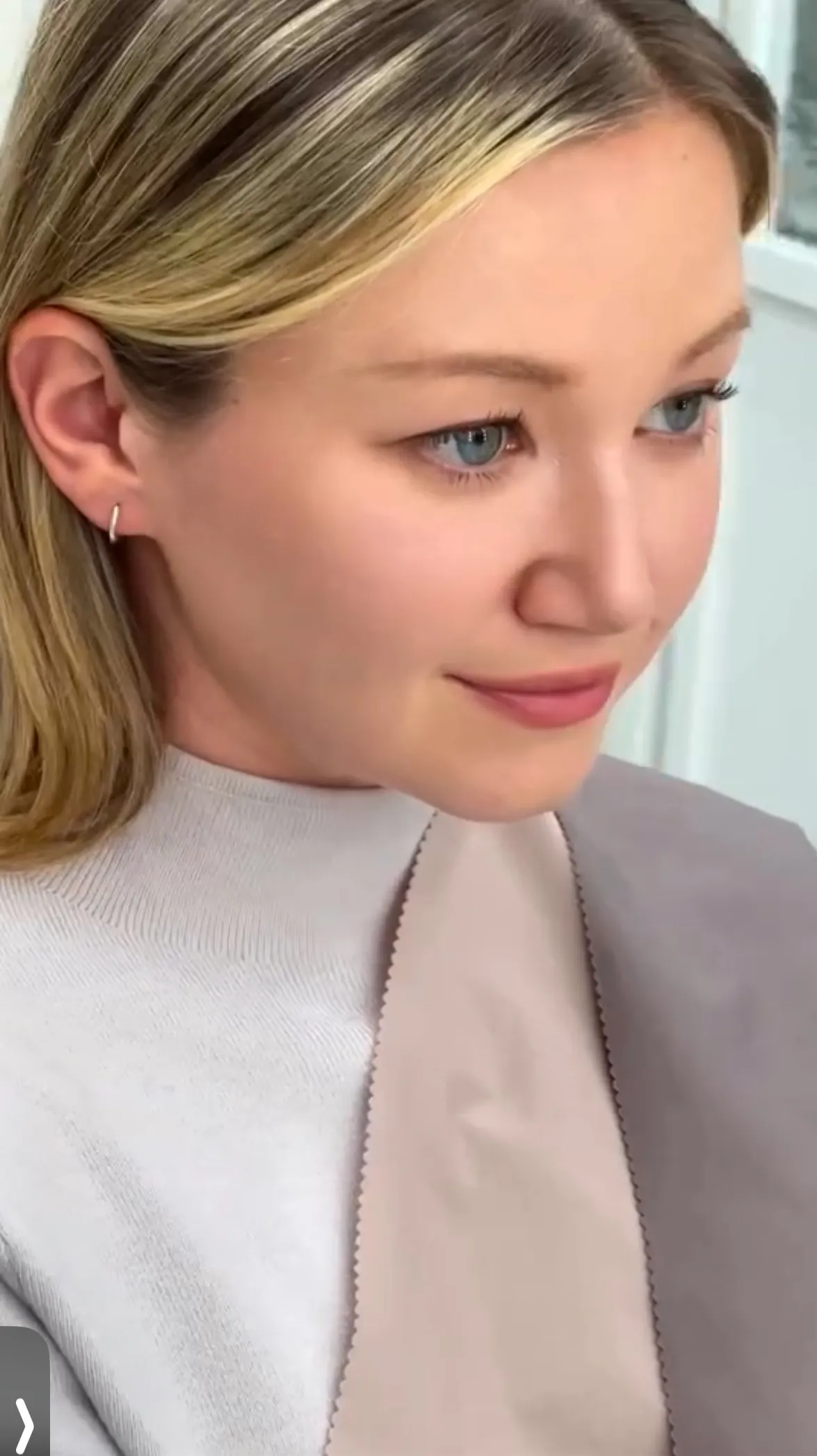
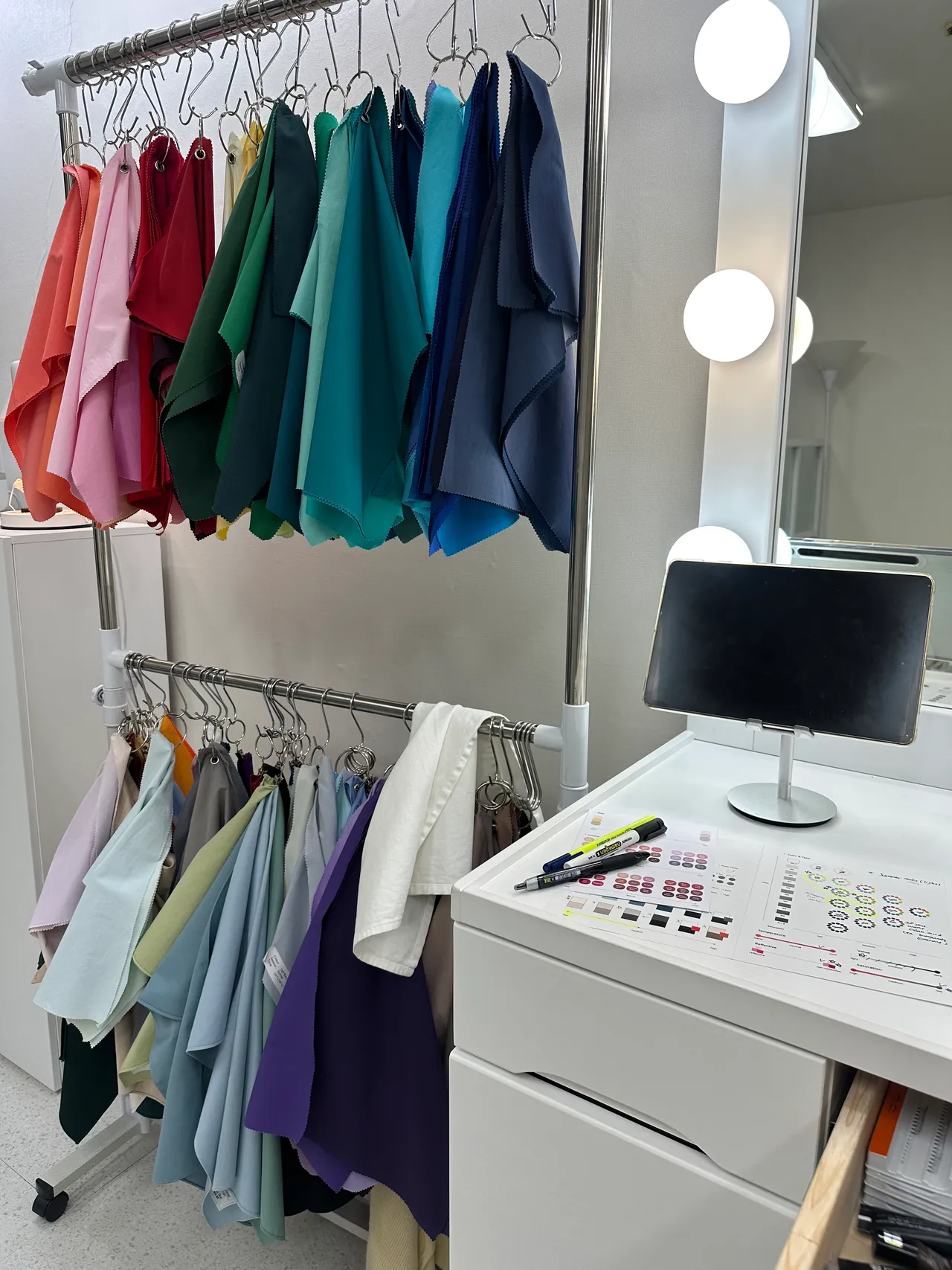
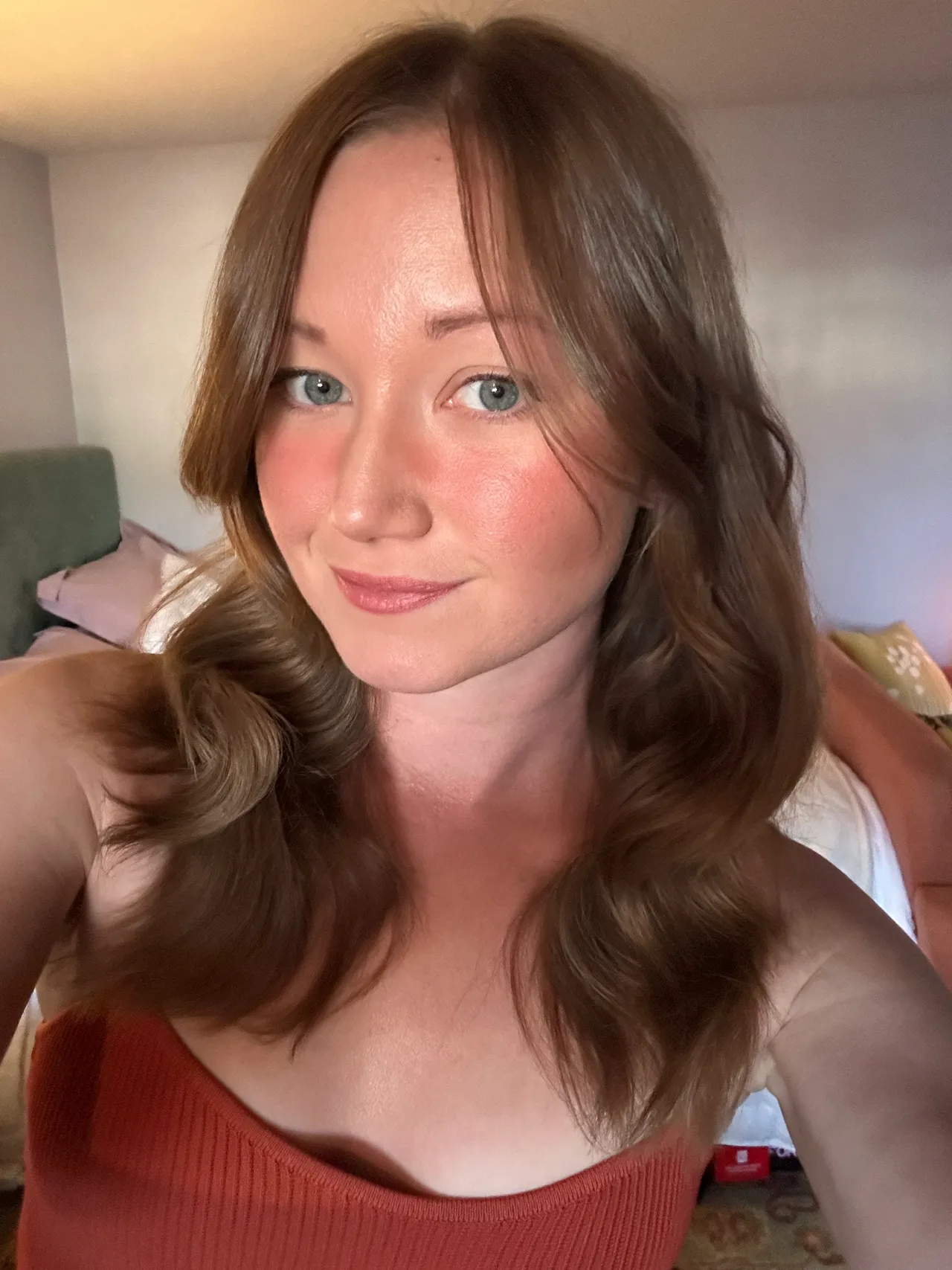
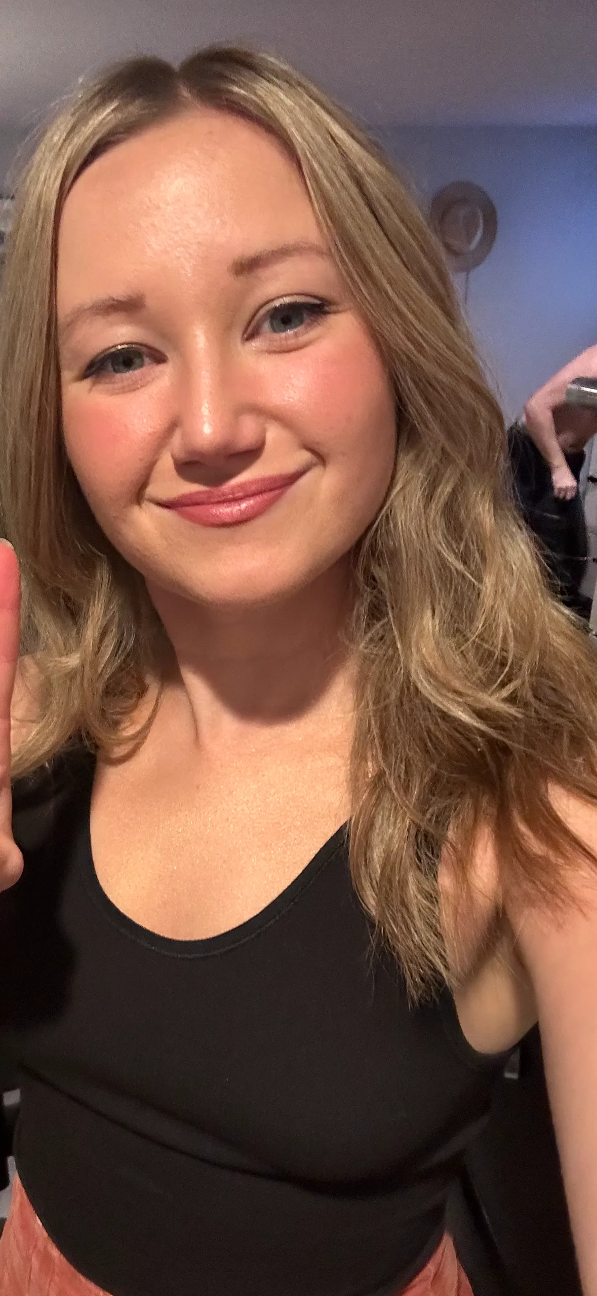
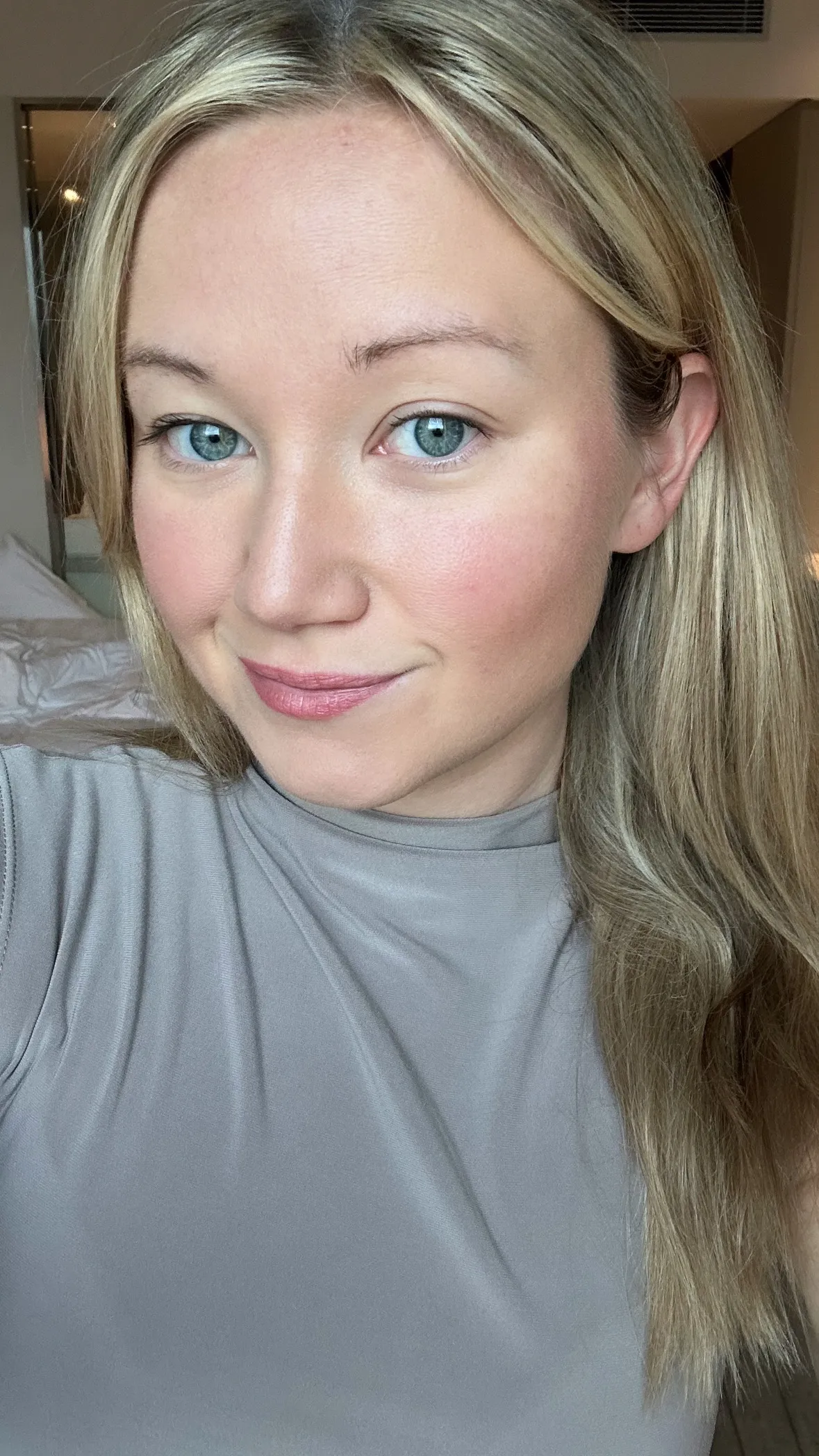
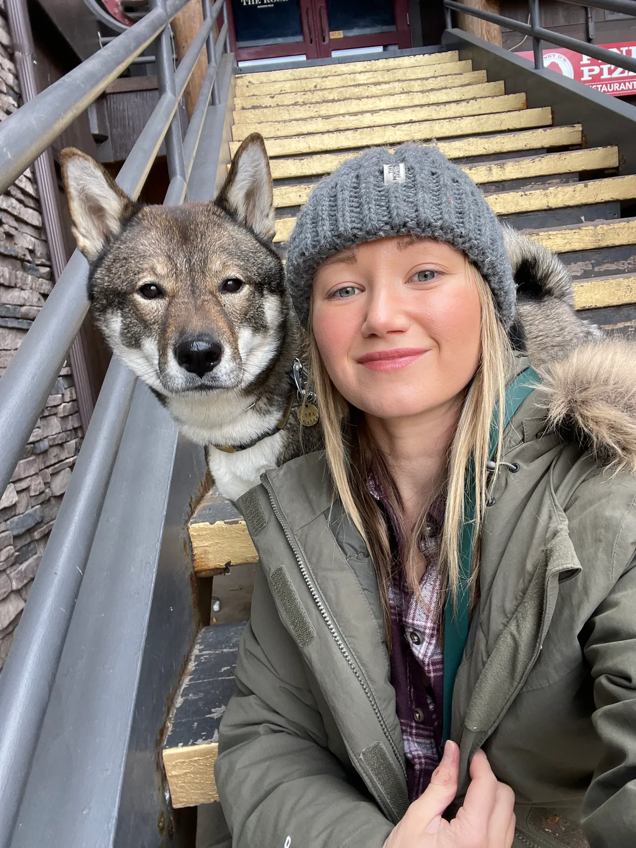
This is the cool light summer color palette she created for and the professional makeup on me (and her favorite colors).
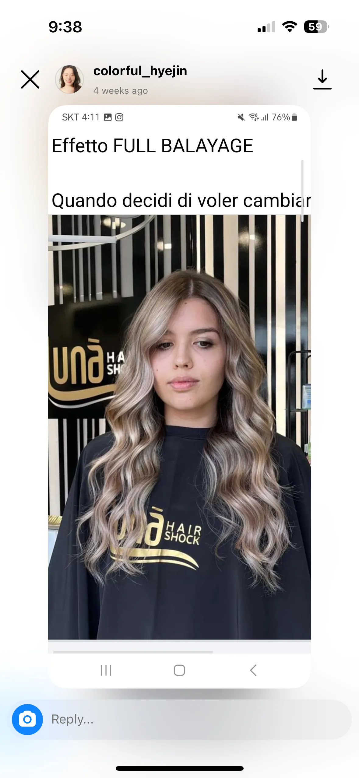
Where did I get my color analysis done?
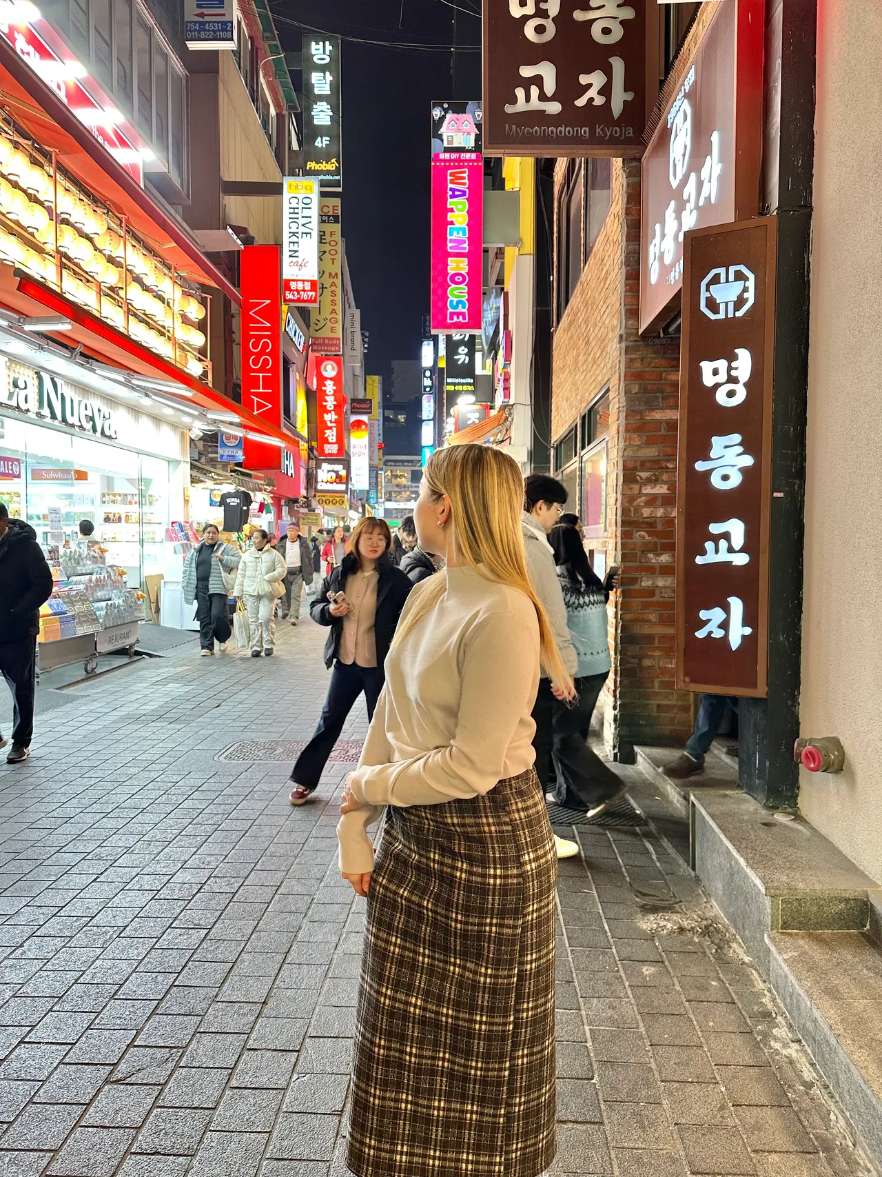
It was ~$250ish total for 2.5-3 hours, and that covered the professional analysis of every color and the makeup, but you can just do the analysis if you're on a budget. I wanted recommendations for makeup as well. I did a lot of research on Reddit and went with color .jpg and messaged her on instagram to book an appointment in Gangnam in Seoul, South Korea. If you're visiting Seoul, I have a whole blog post on all the other beauty treatments and self-care things I did while I was there (e.g., 15 step scalp renewal, full body dead skin scrub, facials, etc.!).
She made me feel so comfortable and was so kind and polite! I appreciated that because the process is a bit unnerving since you show up in no makeup and might find out your favorite colors are some of your worst! It was a room with just us and the makeup artist (who also served as the English translator since she grew up in LA). The makeup artist was a former portrait painter, so she studied the dimensions of my face to determine eyebrow shape and width; it was insightful to have her describe how my brows needed to be thicker due to the dimensions of my face. The Korean makeup beauty standards are different than American since they focus more on plump/younger faces and no contouring, since that makes you look thinner and older. I thought that was so interesting since I've always thought contour was a must since my cheeks are wider.
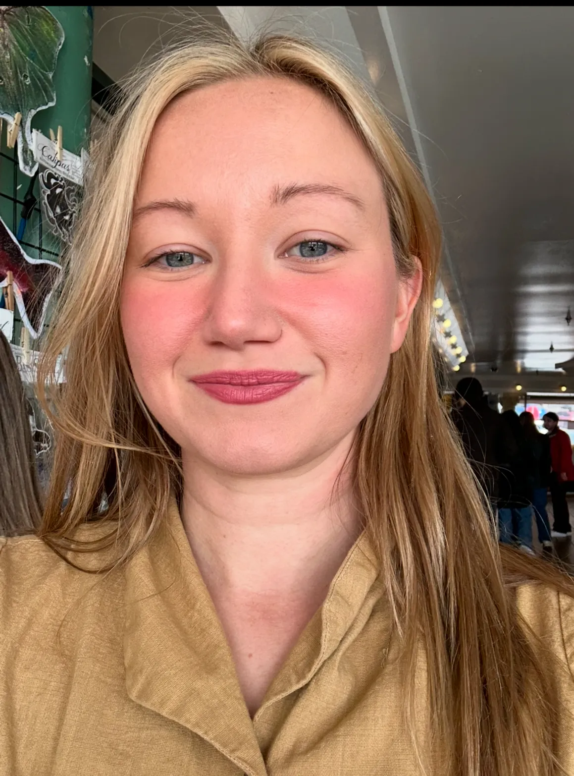
Understanding the Soft Light Summer (mute) color palette:
- A cool-toned, muted palette with soft and subtle hues.
- Key characteristics: colors are not too bright or dark but instead have a gentle, blended quality.
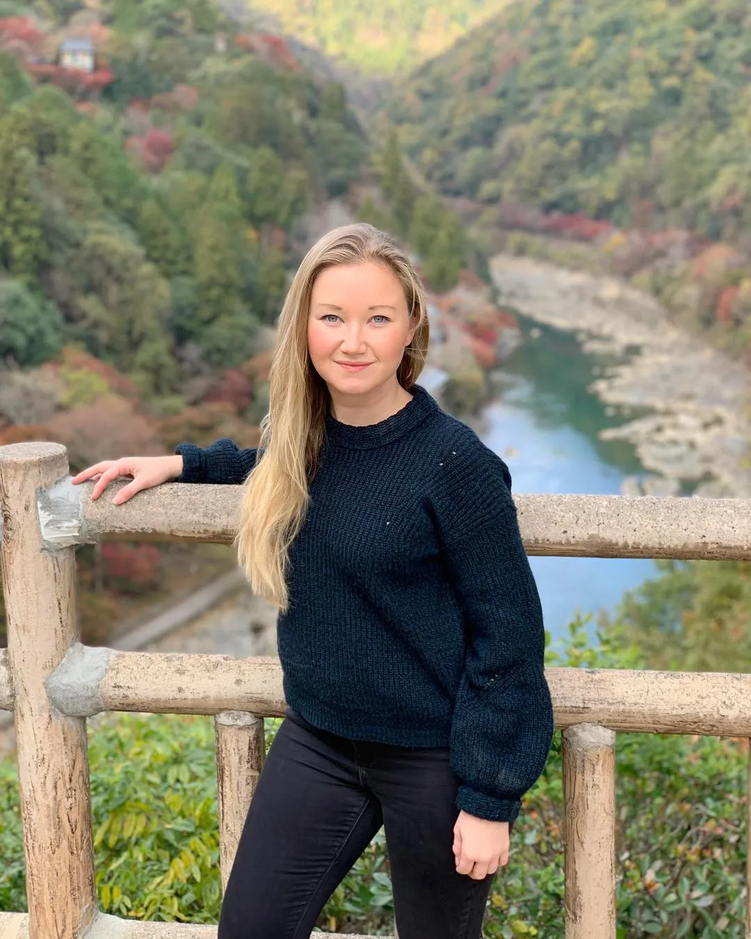
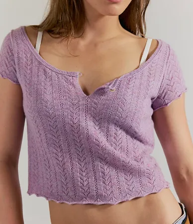
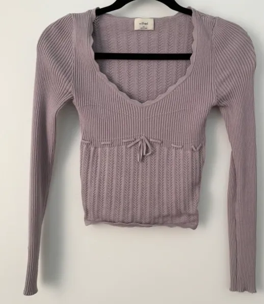
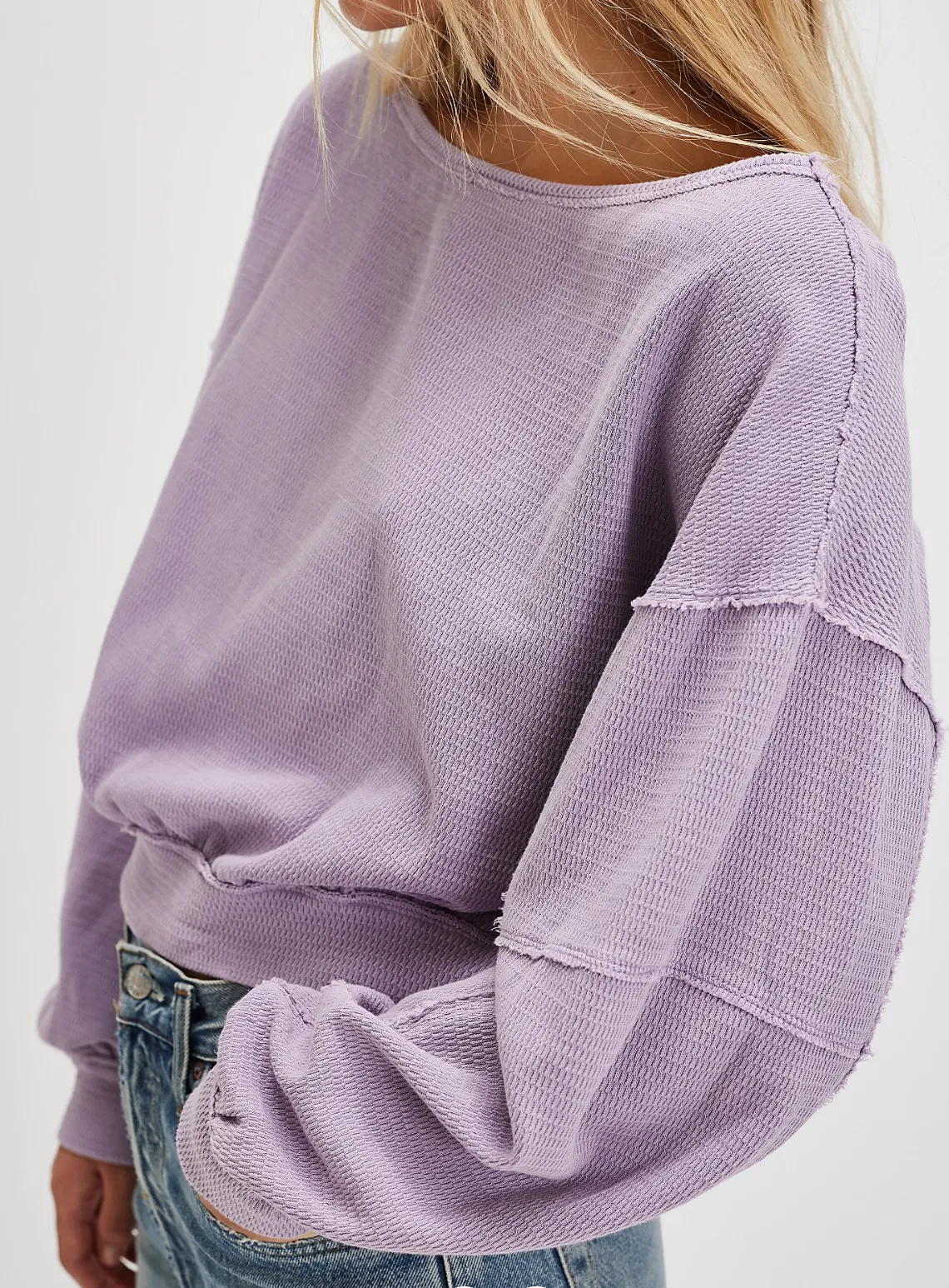
- Examples of core colors: soft lavender, dove gray, dusty pink, muted teal, and misty blue.
- Best neutrals: cool grays, taupes, and soft navy.
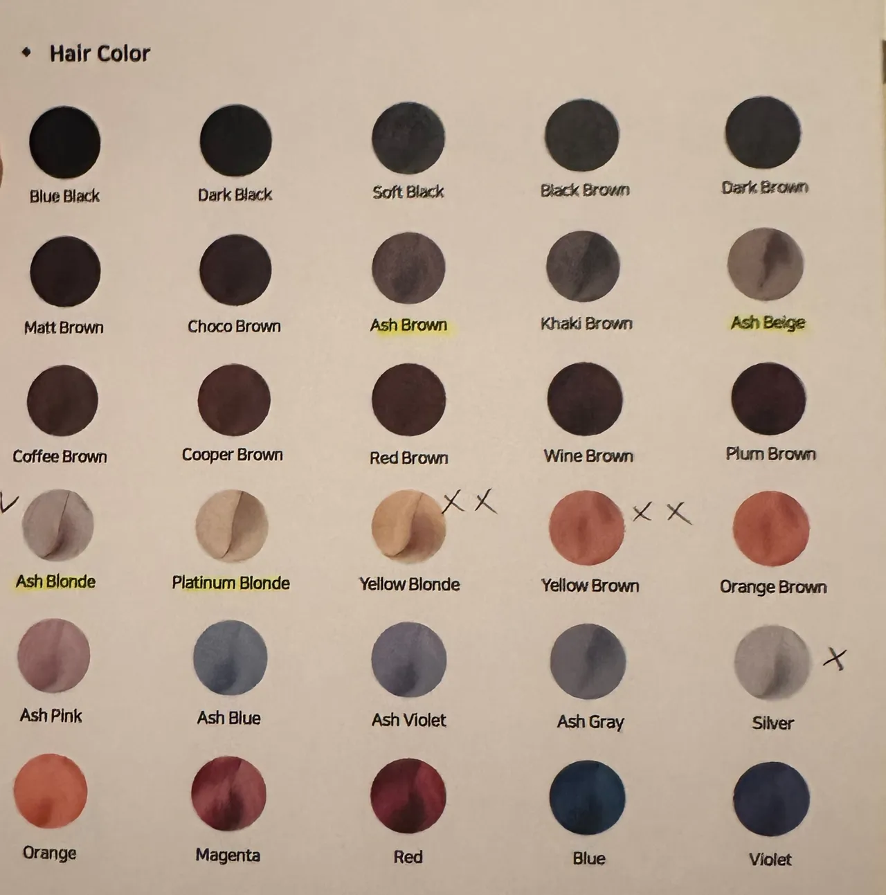
- These colors harmonize with cool undertones, lighter hair and ash colors, and soft features.
Want to explore your color palette from home? I built a styling and color analysis web app called StyleMeMama to help you discover your best colors and styles. Use code somewherewithsora for free access — limited to the first 25 users!
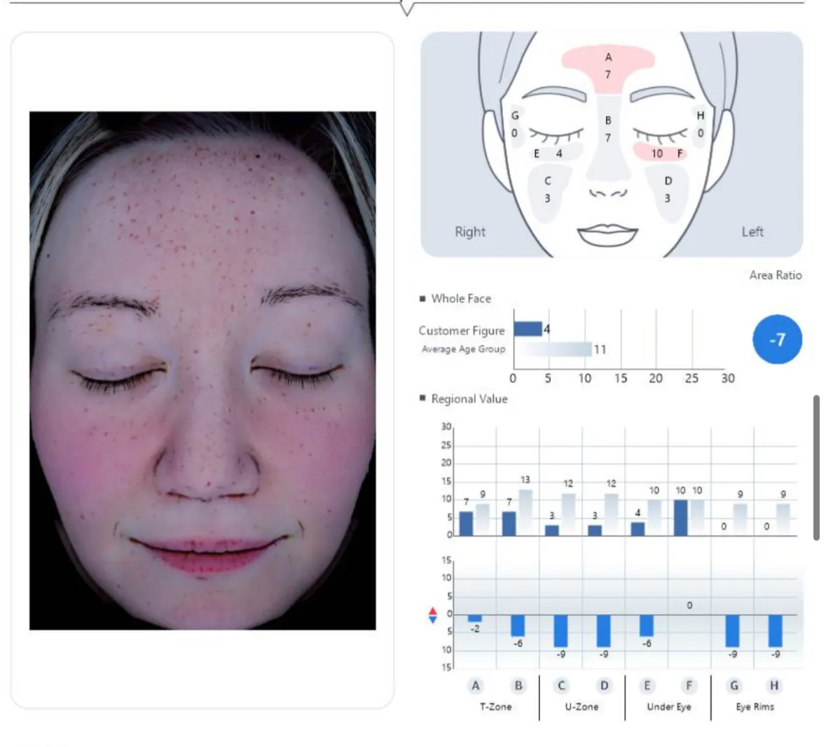
I also recommend getting your skin age analysis done while you're there.I have an entire lengthy blog post going through every page of the skin report and all the products recommended to target areas.
The process of getting the analysis done in Korea
A professional color analysis involves identifying your skin undertone, hair color, and eye color to determine your seasonal palette (e.g., Cool, Warm, Soft, Bright).
Preparing for the analysis: It started with me washing my face to remove my sunscreen. You will have the chance to cleanse your face from sunscreen and makeup when you arrive. Wear your contacts if you have them (non-colored if you use those, since that affects the analysis accuracy). It's also best to wear a simple, lightweight tee so she can easily place the drapes over you.
After washing my face and using a serum, I needed to let my face's redness cool down, so we started with a quick self-assessment survey where she asked a few questions about my style preferences and colors I like. She looked at my eyes with the makeup artist, and they discussed the lightness and grayish blue tones in them, which drew her closer to a muted and light tone. She also took a look at my forearms, where the skin is more protected (less UV damage) and where the veins are more visible; here, she looked at some of the rosy tones in my forearms and paleness. She was already leaning toward light summer before the colors started, but it was quickly confirmed after the first few drapes of colors. She even identified that lower contrast was a better fit for outfit choices as well as color matching.
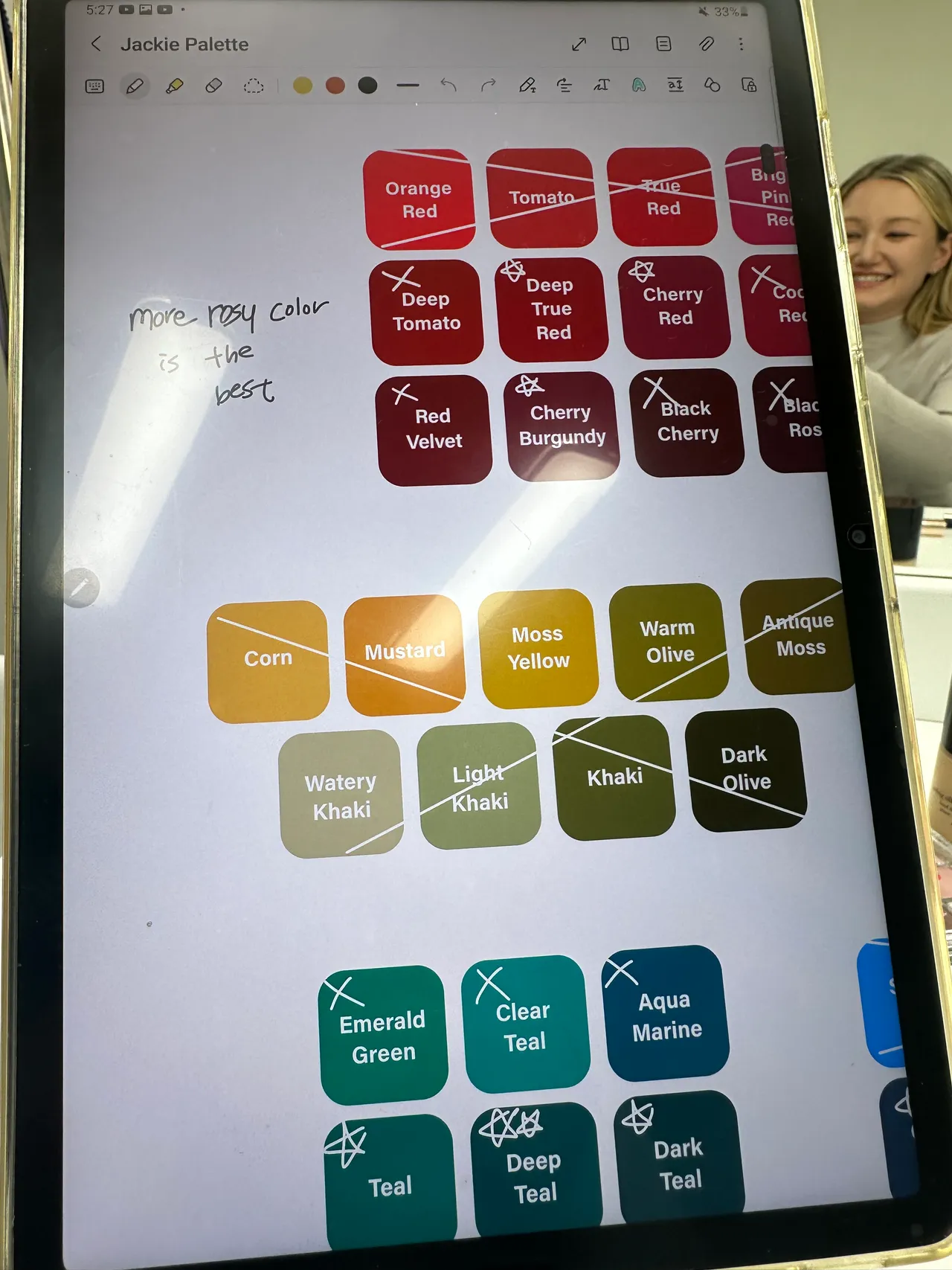
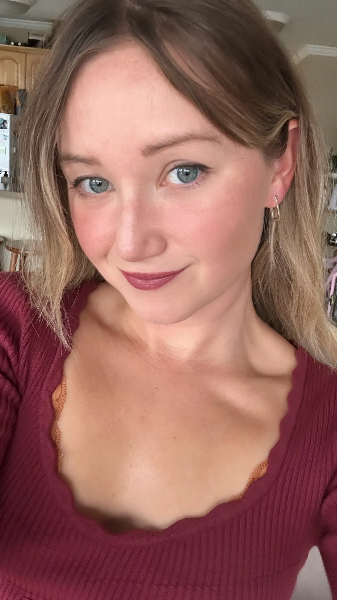
Analyzing each shade: She placed every shade on me, she gave me notes on the color, whether it could work or if it was really out of my palette, and also made notes on her iPad, starring shades and crossing out ones that were out. Some colors she specified as "glam" and recommended these shades when I want to look glamorous and fancy. These were more of the dark teal, deep burgundy type of colors. So while they're not part of the everyday look, they can elevate my look for specific occasions (e.g., weddings).
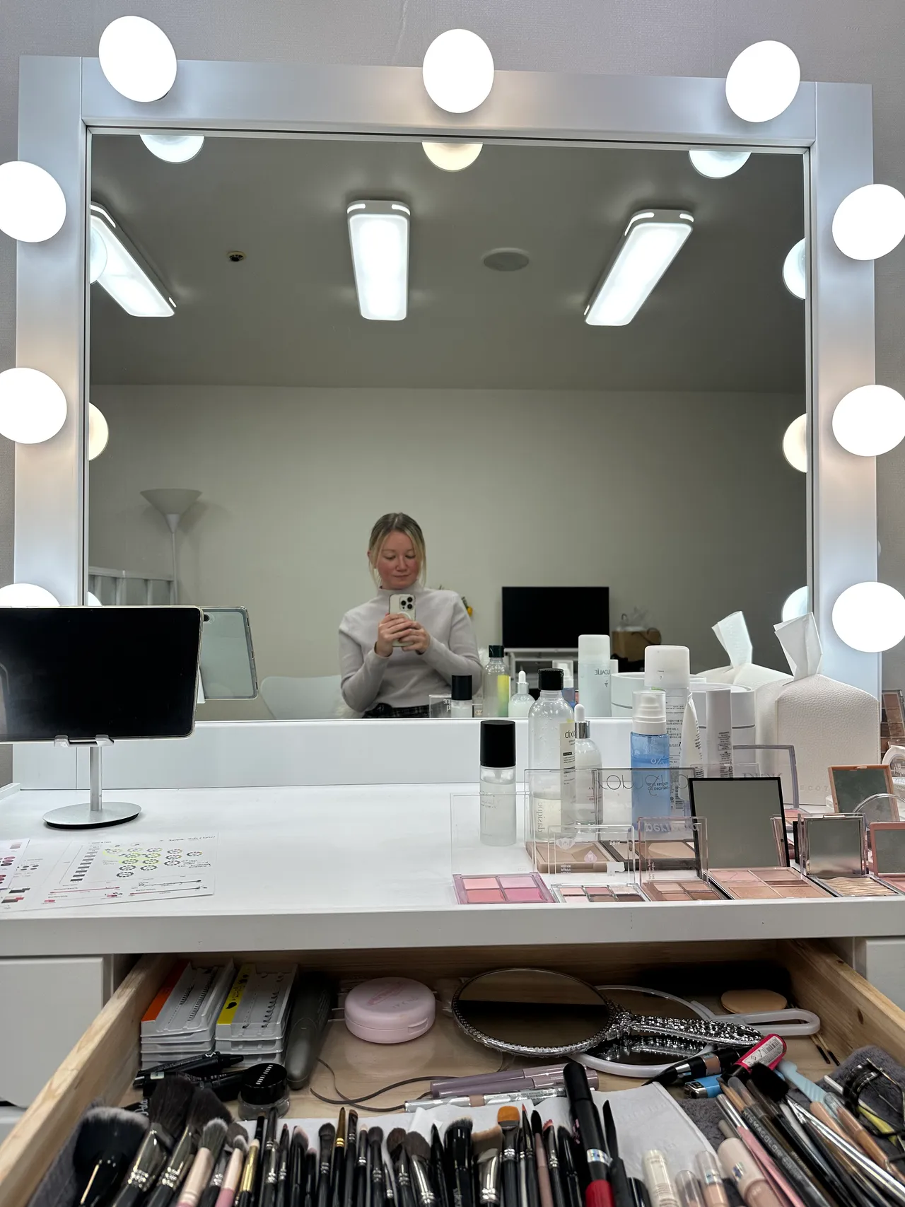
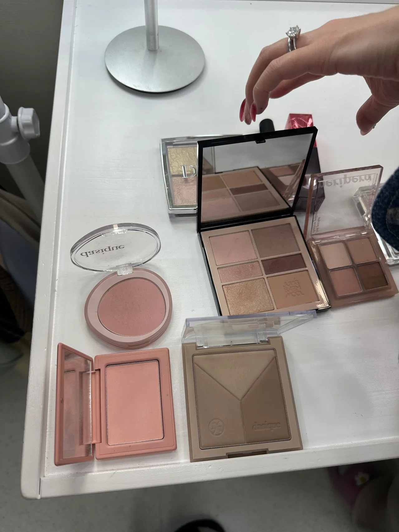
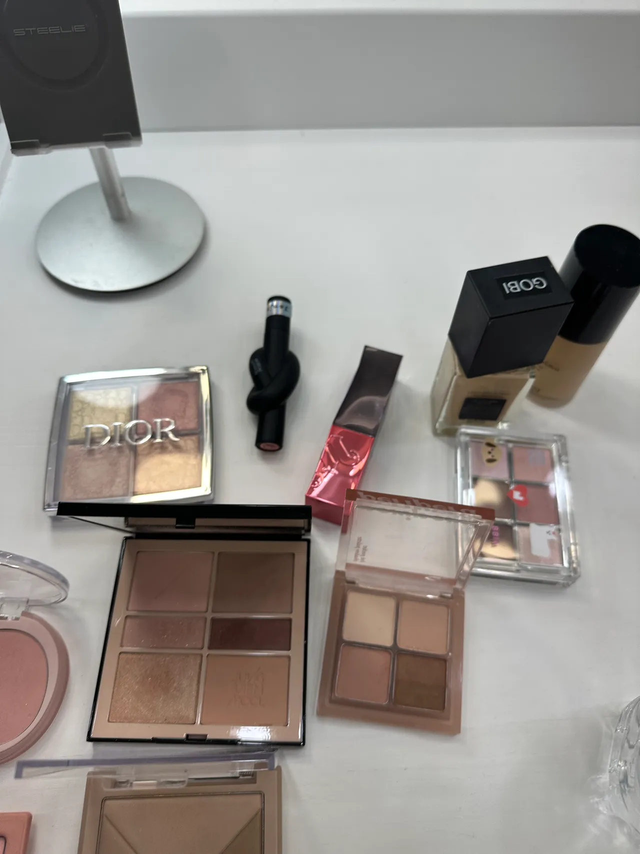
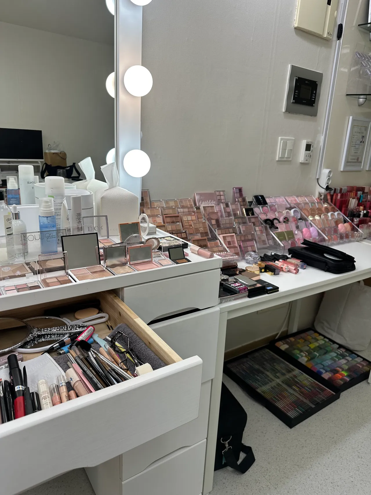
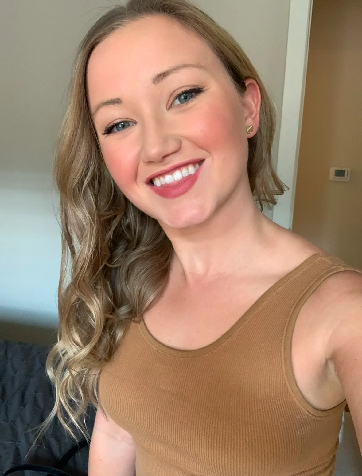
Makeup: The professional makeup was last. She said my skin has some yellow tones to it, so adding a hint of green in the foundation can help counter that. She said I don't need much blush because my face is naturally flushed with rosacea from the colder temperatures. Contouring isn't a thing in Korea since they want to look younger and fuller. She recommended black mascara, still curled the lashes, but said I should stick to brown eyeliners and tight-lining. The colors below she stared at for eye shadow, and then the liner colors. The lip colors are also starred, with more of a neutral and natural color base for the majority of my color palette.
Hair color: She said my hair needed a toner and that it was also like 3 different shades lol. I had been traveling for the past 4 months, visiting family on the East Coast and traveling back and forth to Taiwan for work, so I needed a trip to the salon desperately. She sent some photos of good hair colors and also a palette to stick to based on what she saw worked with my skin tone and eyes.
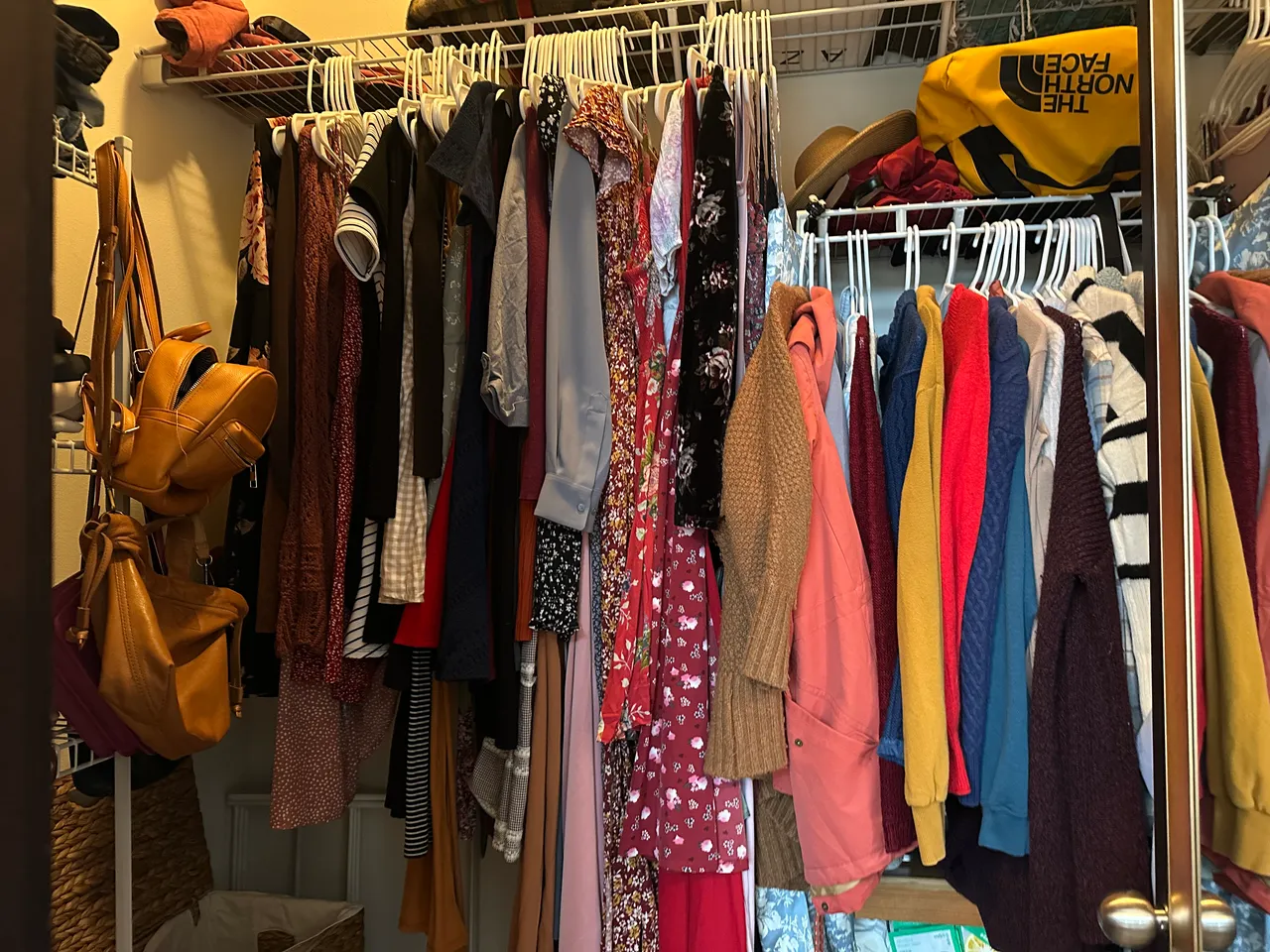
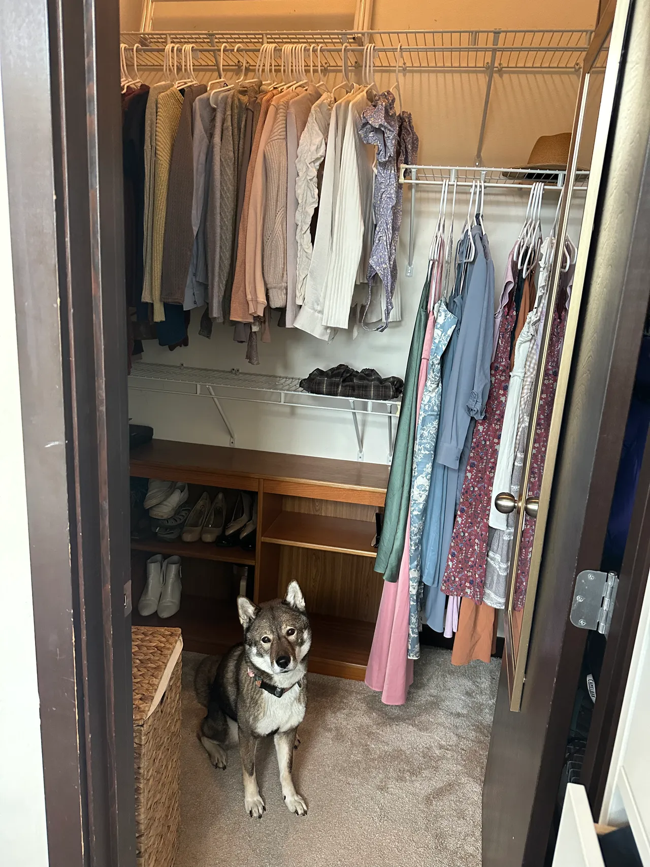
My closet before and after the color analysis
I gained insights about which colors to avoid and why, which has been instrumental in creating the wardrobe of my dreams. Removing these items has simplified my wardrobe, made shopping easier, and helped me get closer to building the ideal capsule wardrobe. The more I get rid of clothes outside my color palette, the easier it becomes to create outfits that look both flattering and make me feel confident. Below is the before and after of my closet!
reflections and assessing past outfits and colors
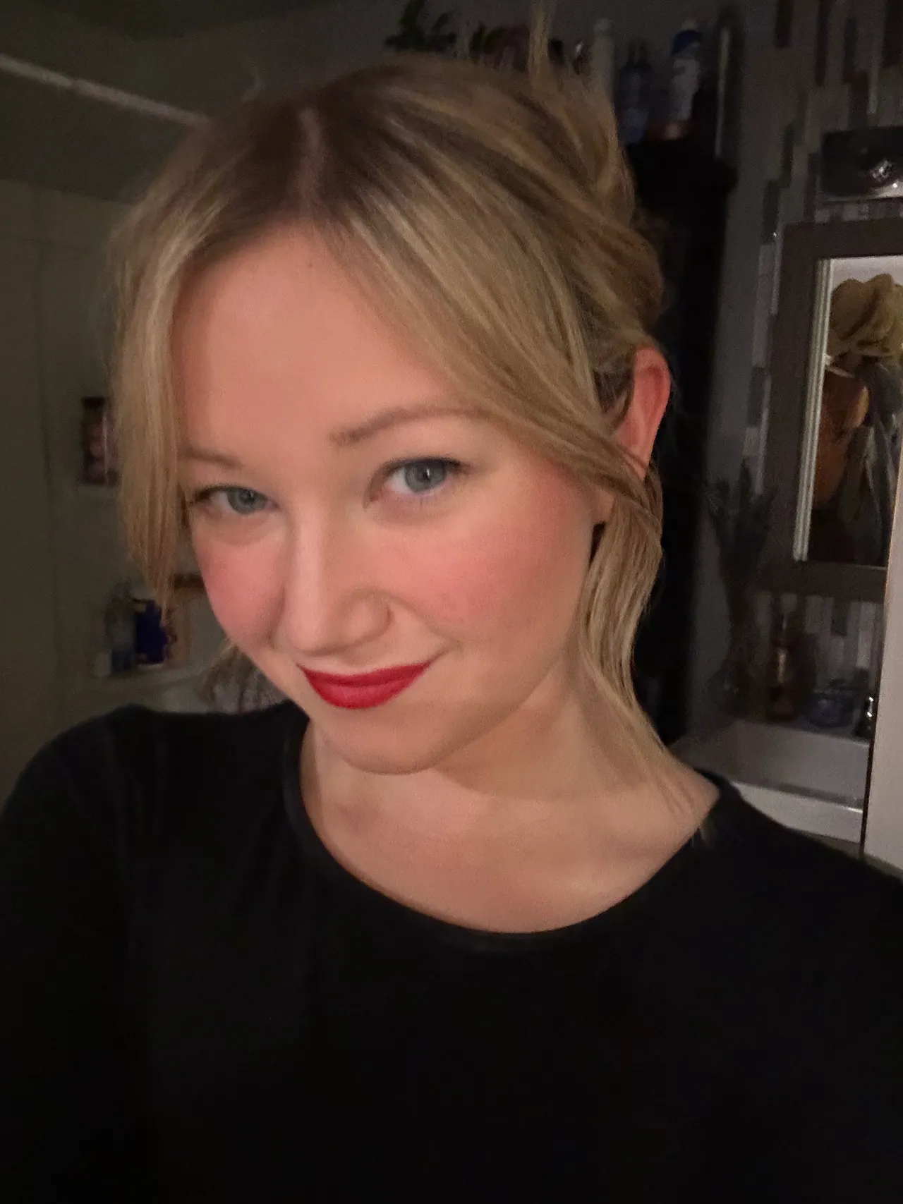
Colors that clearly didn't work (adding more redness to my face). Certain warm tones make me look washed out, or overly bright hues overpower my features, and colors like rich red or rust orange add more redness to my face since I have pink undertones. These colors are earthy, dark, and overall don't offer much compared to other colors more aligned with my color season.
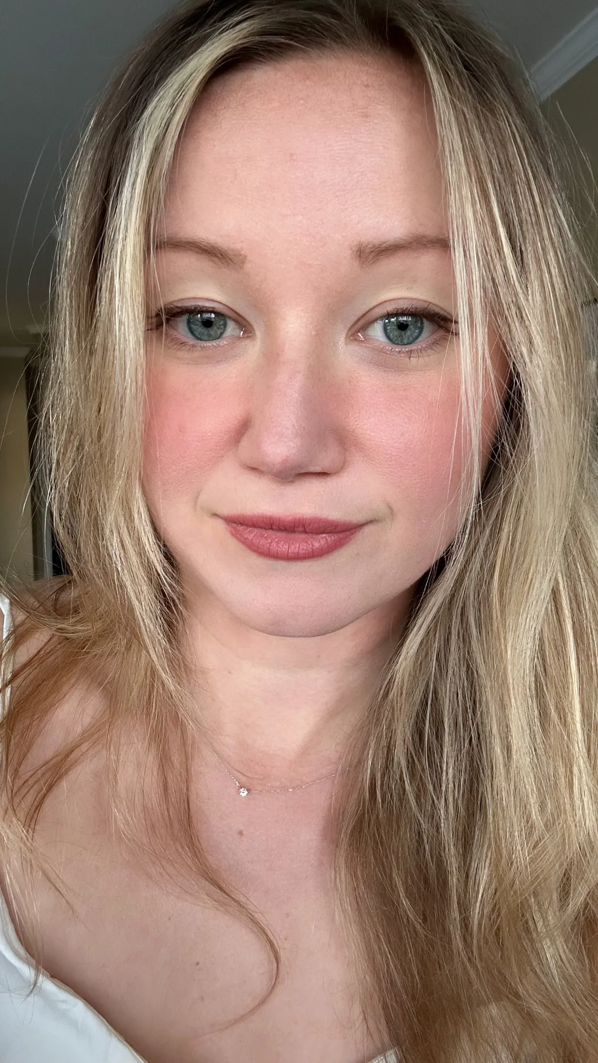
Colors that effortlessly looked better and were either lighter, softer, or one of the "glam" colors.

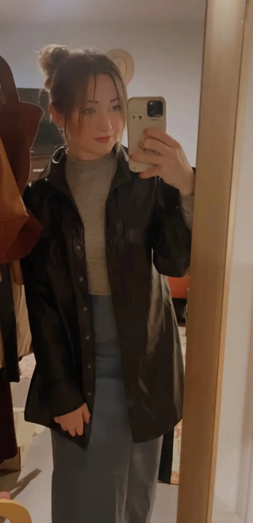
working with darker colors
Some tips for helping with colors outside your palette: if you like black, choose a statement color for lipstick; I've found a pop of color can balance the overall look. You can also lighten a look by adding a lighter scarf, soft or cool-tone hat, or adding a softer color palette under the black outerwear.
I'm using my highlighted hair to brighten the area around my face while wearing black. If you have long, light hair, you can simply drape your hair in front when you wear a darker color, and it'll immediately bring light back to your face, super easy!

best Brands to encapsulate the capsule wardrobe
Some brands are consistent and work well with petite body types. I'm pretty basic when it comes to my general style, but now and then I do enjoy a vintage or unique piece that I find while thrifting or traveling. But in general, I stick to the brands that are consistent and have good return policies if the items I order don't work out! Having good resale value is also important because I like to rotate items like dresses, jeans, jackets, and shoes more often.
I've moved 10+ times in the last 5 years and have had 4 cross-country moves, and I always love it when I can sell pieces and clear up space when preparing for a big move. Selling is also more likely to guarantee the piece gets loved and used, versus donating, where it may end up in a landfill.
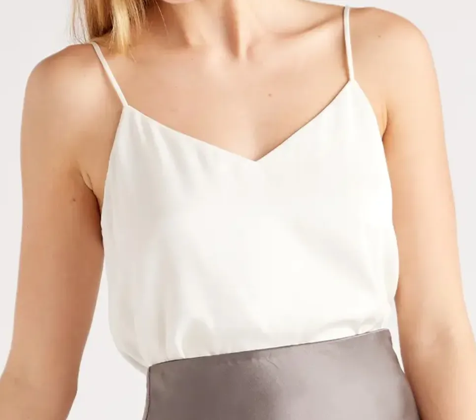
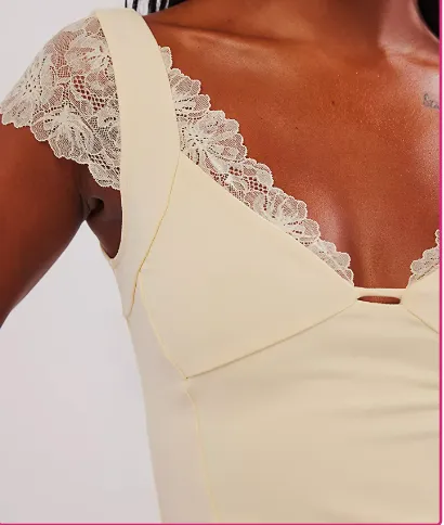
I would say my style leans more romantic; I adore squareneck and sweetheart necklines, as they open up the chest area by bringing in more light to my face.
- Free People: I am a mix of elegant, effortlessly cool, romantic style
- Quince: staples for affordable silk, cashmere.
- Reformation: ultra-feminine silhouettes, vintage-inspired, flowy
- Anthropologie: eclectic, dressy, bohemian
- Madewell: classic casual American style, high-quality petite denim, cozy knits, shoes
- Sezane: chic, timeless, sustainable
- Abercrombie: modern, stylish casualwear. Good for petite jeans.
- Petite studio nyc: petite-sized, tailored, feminine, sophisticated
- Aritzia: elevated contemporary basics, statement pieces, minimalistic, polished, and clean lines
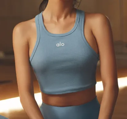
- Alo: stylish athleisure
Creating a Wardrobe aligned with your Color Palette Season
Once you identify the correct season, you can start to identify the most recurring colors that you like in your color palette. For me, I gravitate towards soft lavender tops, pale to light blue sweaters and tops, off-white or rose white tops, and less black, red, and orange as they wash me out. Some colors aren't in my palette, but I still like them; for example, olive green is super out of my season, but I really like the color, so I still own those pieces and just keep in mind that I may need to highlight other pieces on those.
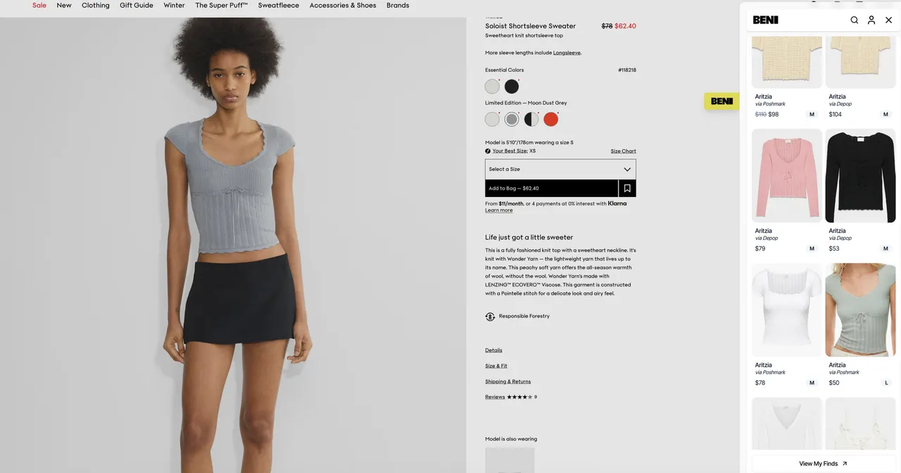
I thrift and shop online at Poshmark a lot, but sometimes will splurge for a specific style or jewelry because I prefer to buy new (or send to my bf to buy me for special occasions). I linked some of these products, and if the link doesn't work, just screenshot and reverse image search on Google. This is a helpful way to find clothing used on eBay, Poshmark, Depop, etc. Another really great tool I recently started using is called Beni. It's a Chrome extension that will search for the item on used markets so you can try to shop secondhand and save some money, and prevent further waste! Sometimes it unlocks unique colors that were limited and no longer for sale.
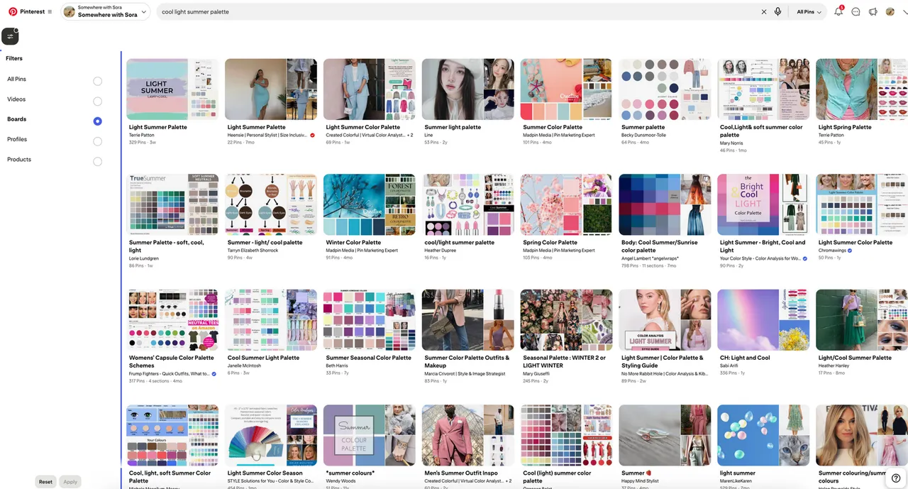
One of my biggest suggestions is to use Pinterest. It's literally a data labelling platform where tons of other women have taken the time to sift through and label data for you, so use it!
If you do a filter for "boards" and then search "cool light summer palette."
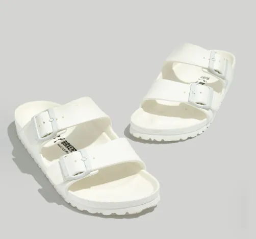
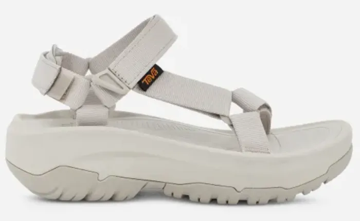
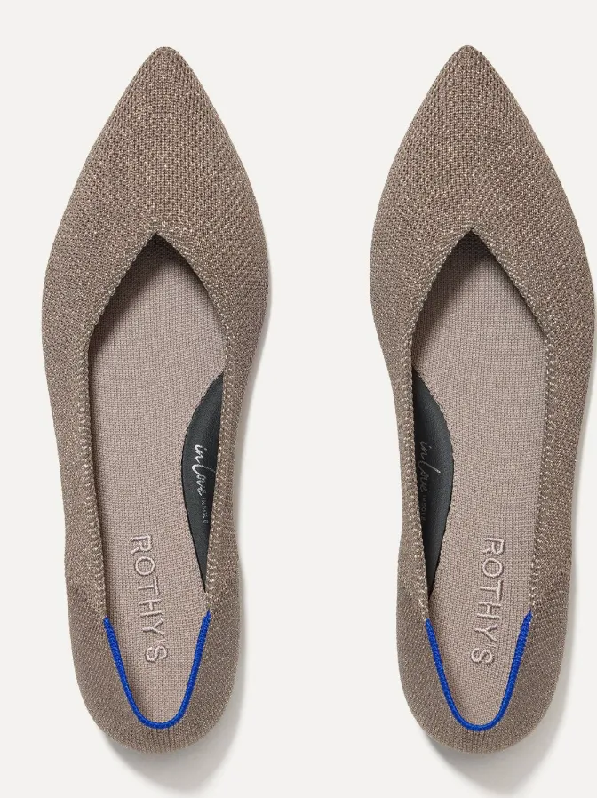
shoes
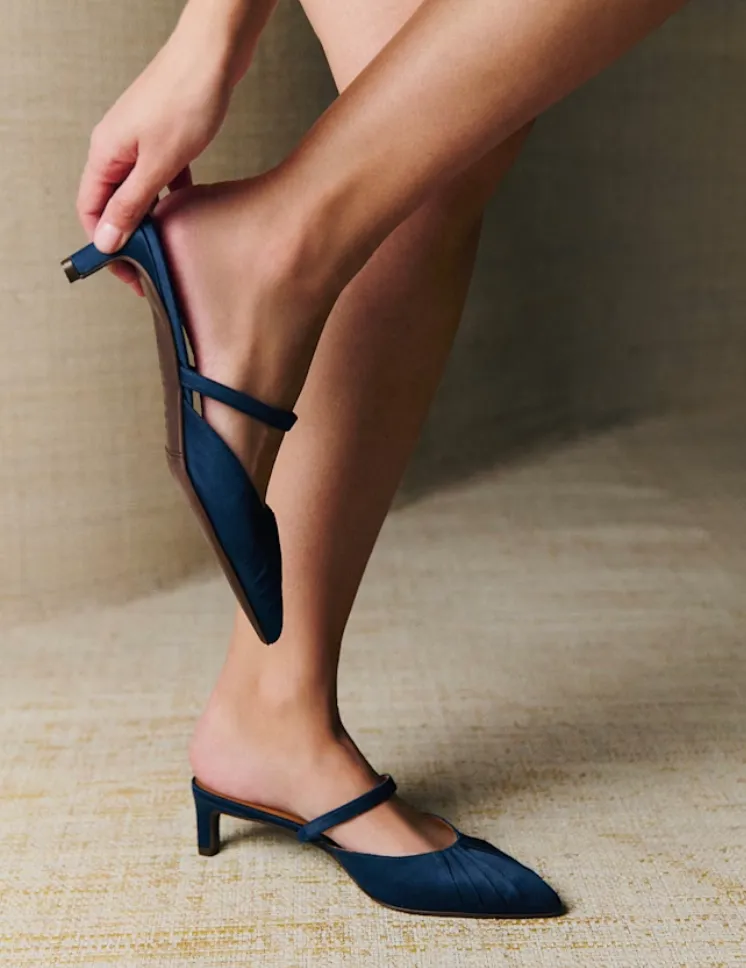
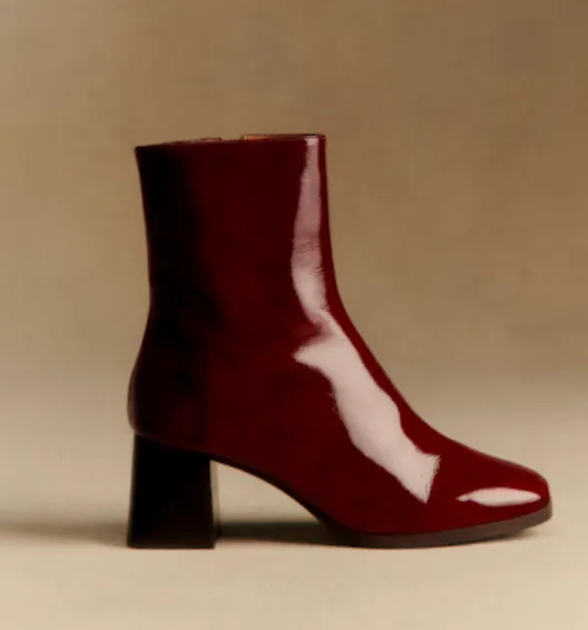
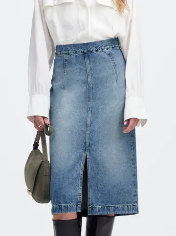
The pointy flats from Rothy's lean warm, but the blue accent can cool them down. They're less harsh than black and can still pair well with an overall color outfit. I also don't think that you need to worry as much about the color palette for shoes since it's so far from your face. I recently got these adorable red boots from Sezane, and they paired beautifully with my long denim skirt and white top, with a suede jacket.
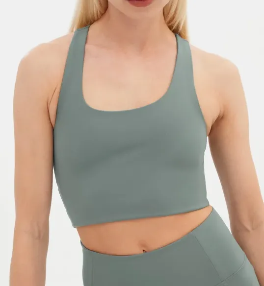
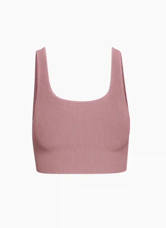
Basic tops
Versatile Tops for pilates workouts or lounging around the home. If there's text, I prefer lighter white fonts like on the Alo Aspire tank below! I have that top in several muted colors. Aritzia's squareneck sculpting top is amazing. I buy them second-hand on Poshmark since the website doesn't have them in stock consistently. The girlfriend collective tops are good for compression when I'm hiking or running. The Aritzia mockneck sleeveless top and the Quince silk top are perfect in-office staples.
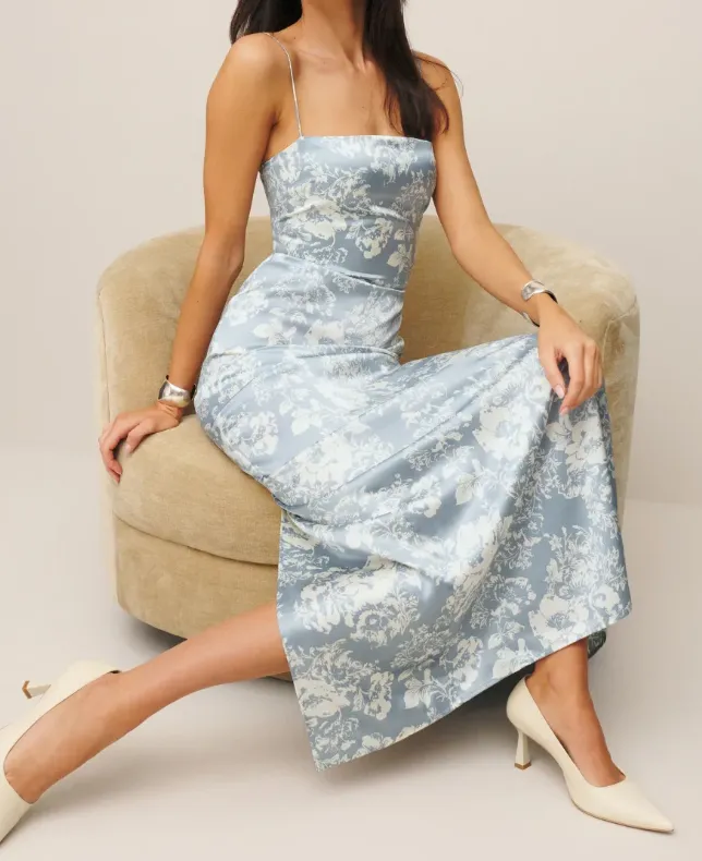
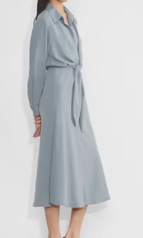
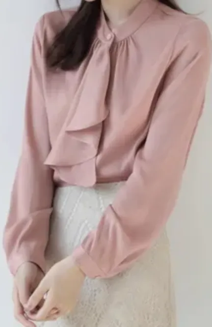
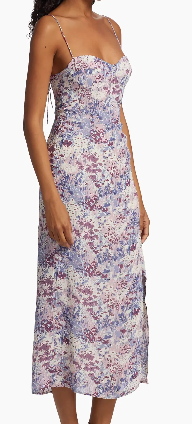
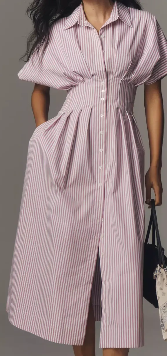
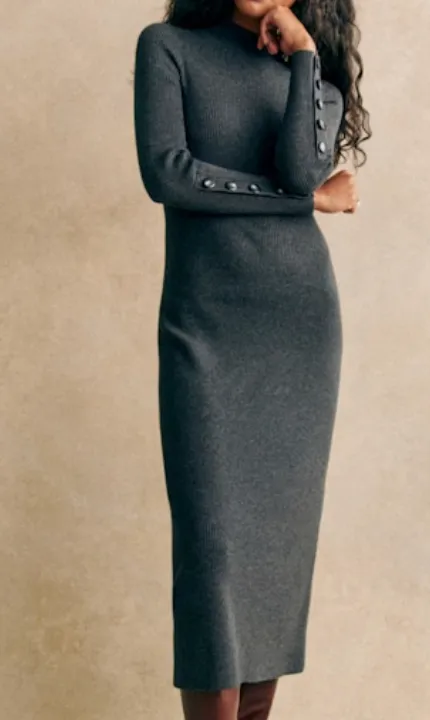
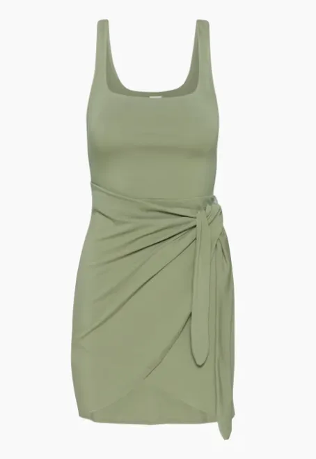
Dresses and outfit inspo
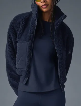
jackets
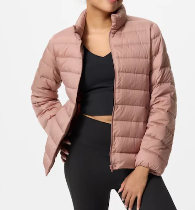
I always love black jackets, but since black doesn't work for me, I go for charcoal and fog colors, sometimes adding in a lighter pink jacket so I can wear a dark color underneath. I go to Solidcore for pilates, so I'm usually wearing my athleisure outfit under a light jacket. So these are some of my go-to jackets I own for style and comfort.
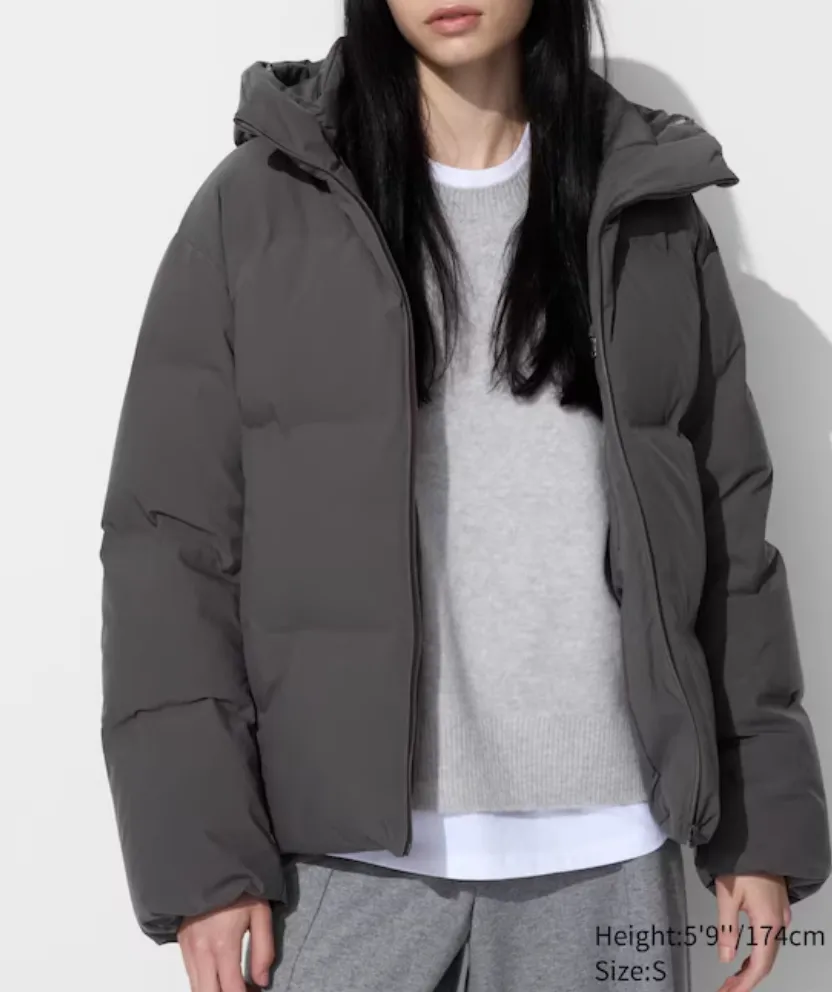
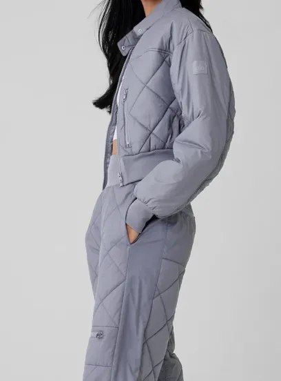
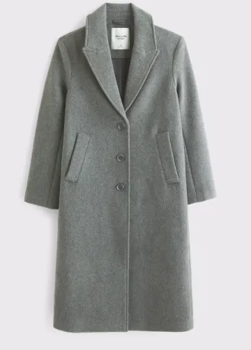
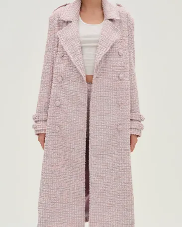
Outerwear
The stylist really liked tweed on me, adding that it elevates a more "expensive" looking style. Using darker colors that are tweed also helps. I love the Aritzia slouch coat, and Quince has a dupe, but it's not as feminine, slightly more boxy on the shoulders, but still more affordable!
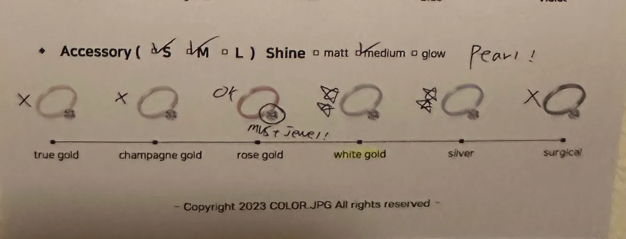
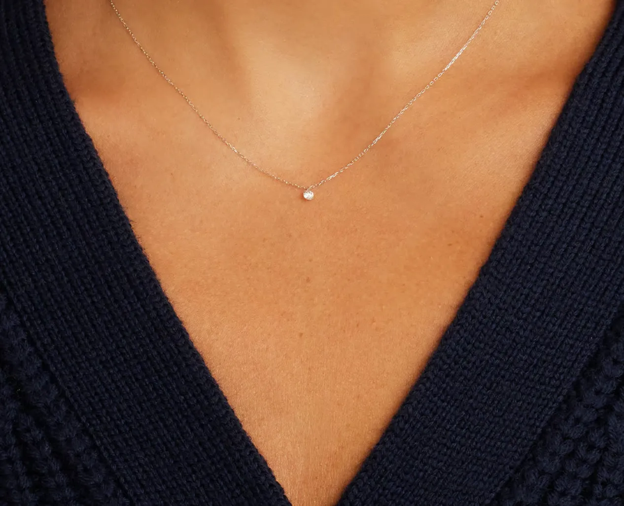
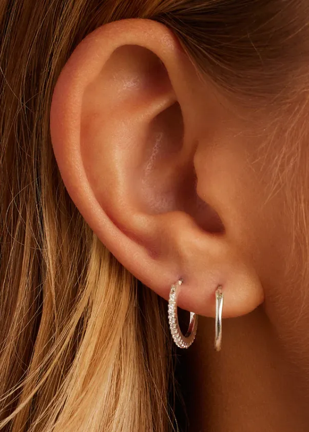
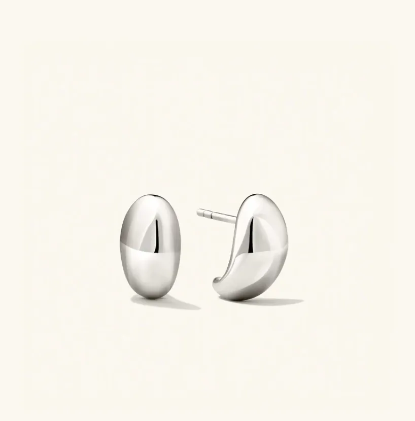
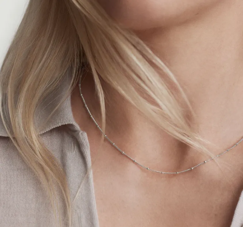
Accessories and Jewelry
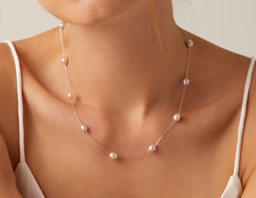
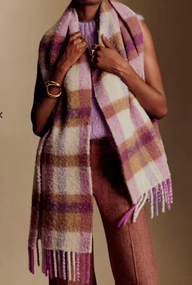
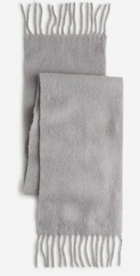
Here are the staples I'm currently working with in my season. The necklace and earrings are part of my everyday basics. Keeping the jewelry minimal, fine, and light adds to the softer look. Soft, light scarves have the ability to lift a darker color up in your wardrobe. If your contrast is lower, then keep the color difference not too stark. If you have a black you love, try a soft, light grey scarf to brighten the color closer to your facial features.
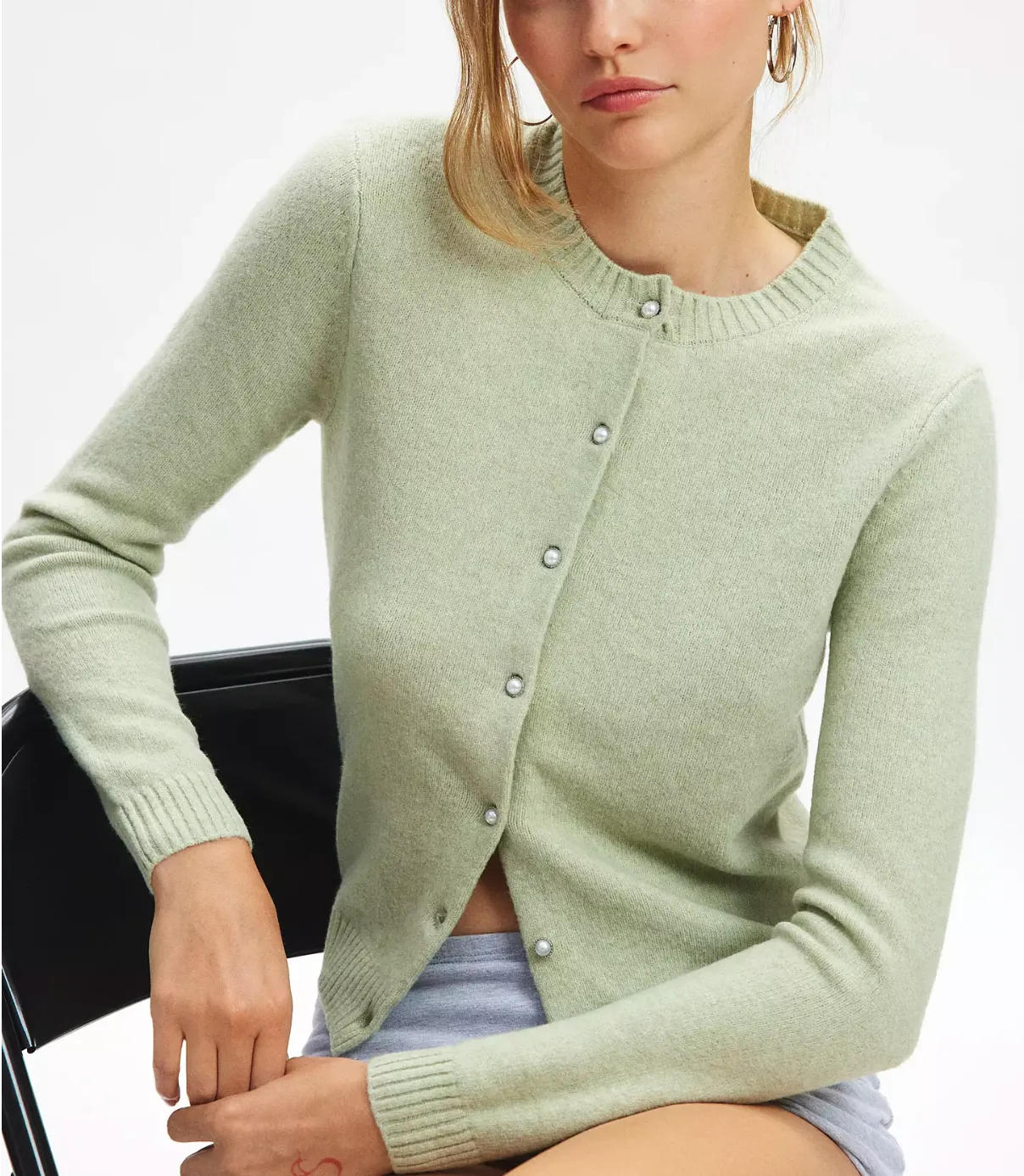
For jewelry, we agreed gold and surgical were not in my season (refer to the chart below), but silver (medium shine, not too matte or glossy), white gold, and rose gold (must have a jewel as noted below in the chart) were aligned with my season. Silver works better for my cool tone because gold always feels really warm and harsh. She also really liked the soft look of pearls on me, both as earrings and as soft accents on clothing (vs dark hard buttons).
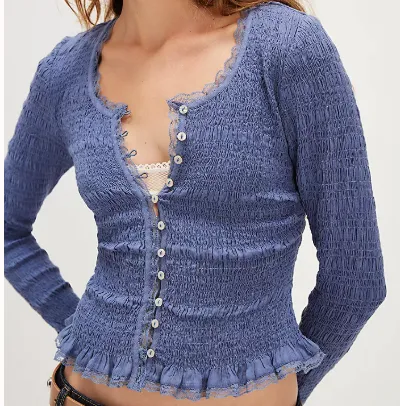
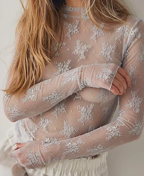
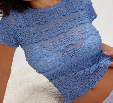
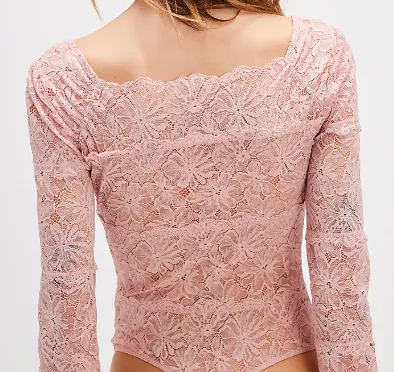
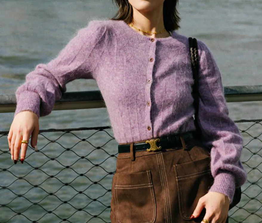
Layering and textured tops
I like to lean into the elegant and romantic style with my layered tops. Textures, delicate, embroidery, sheer, and soft. So while the colors are mostly the same, with soft, muted pinks and blues and greys, there's also a shade of yellow that's allowed in my season, but only one. The stylist I worked with said I can do a pale lemonade color, which helps bring another shade into the wardrobe.
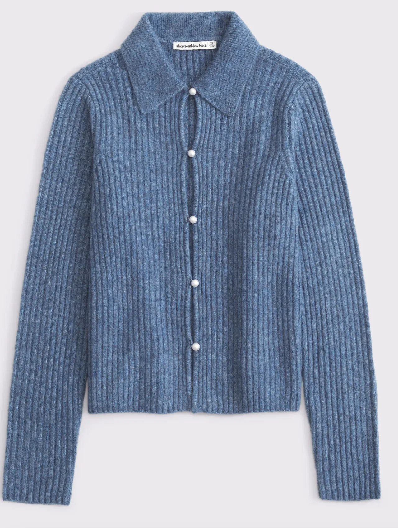
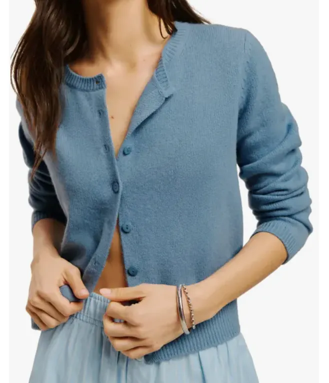
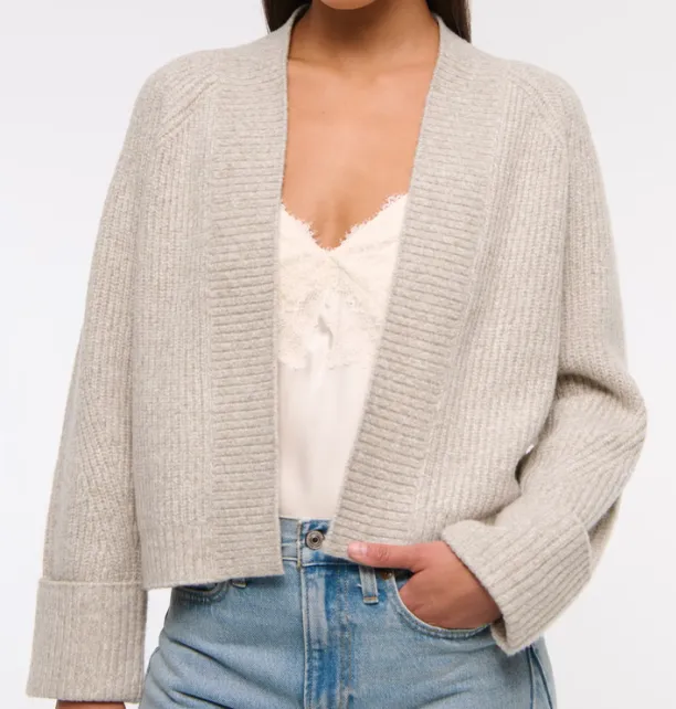
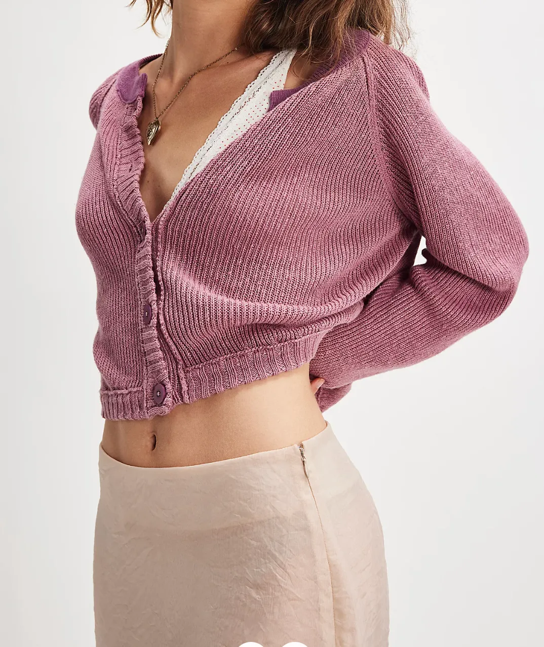
sweaters
Dusty. Pastels. Low to no contrast buttons or pearl buttons for a feminine, soft touch. The white undershirt also works really well to soften the overall look.
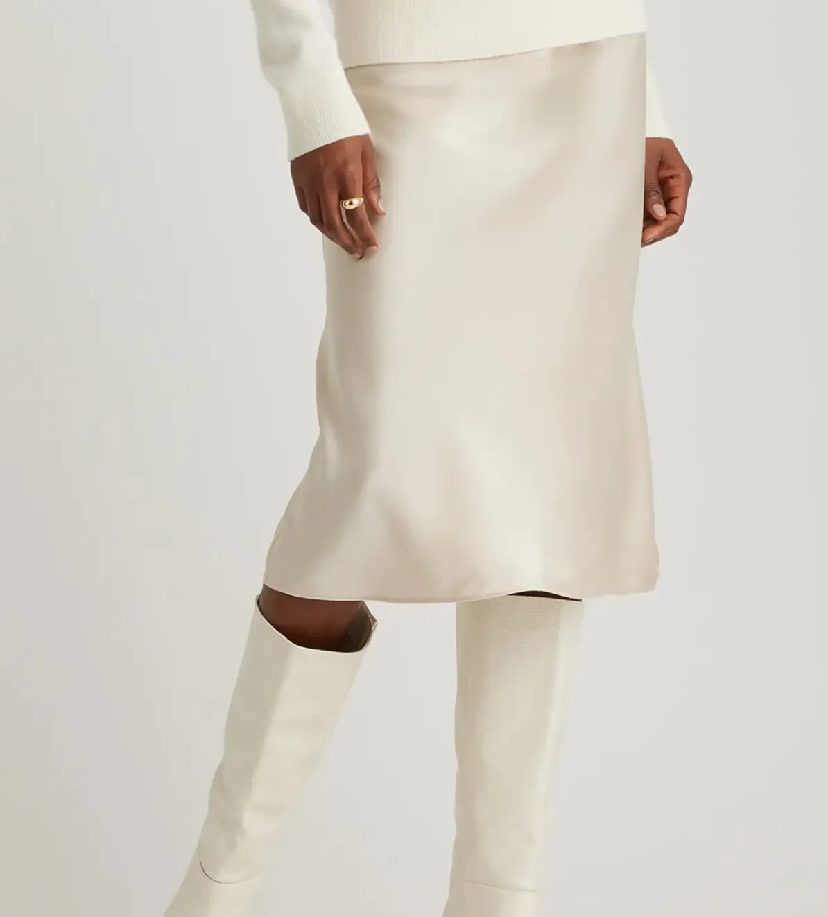
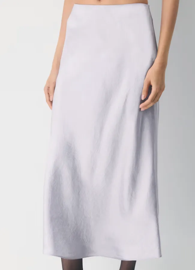
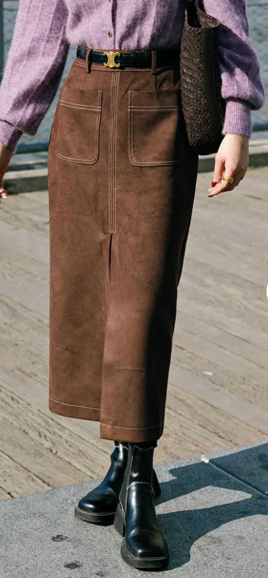
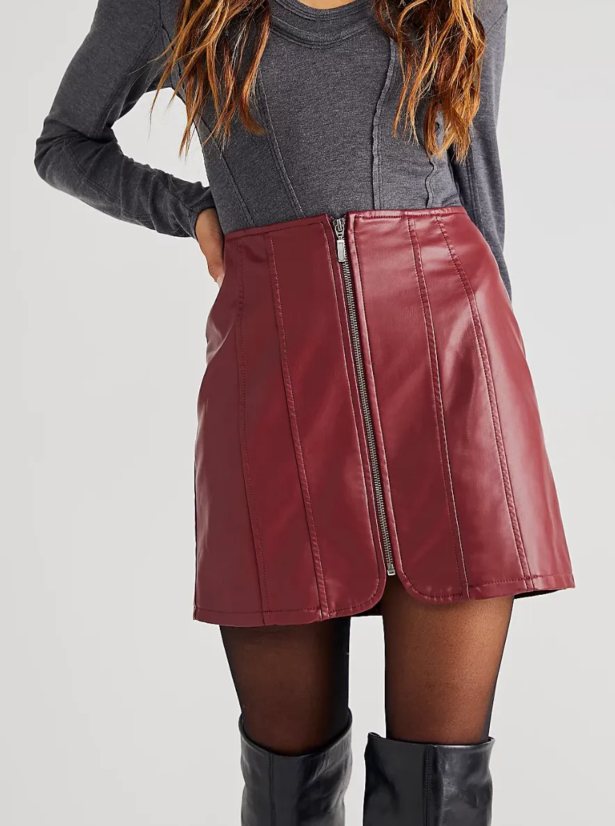
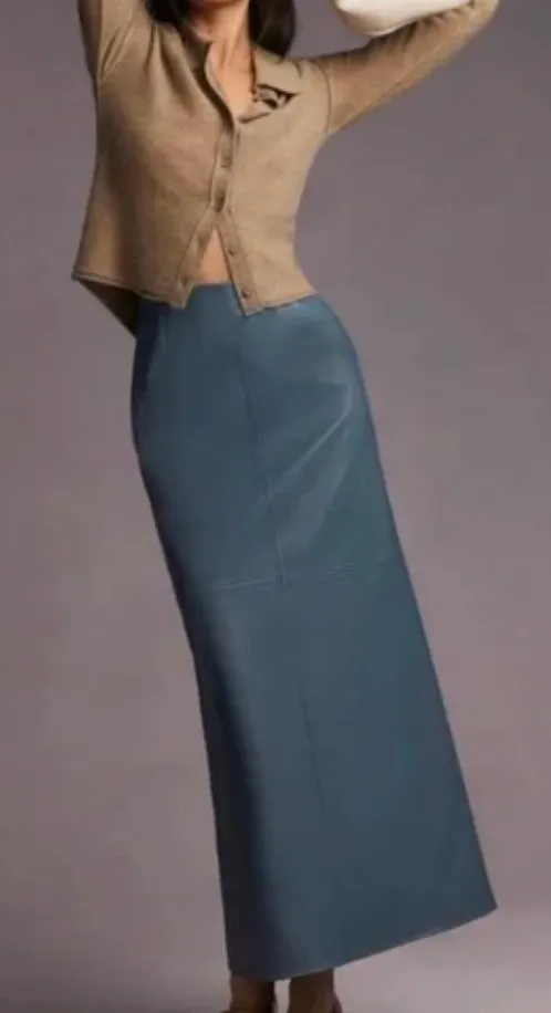
skirts
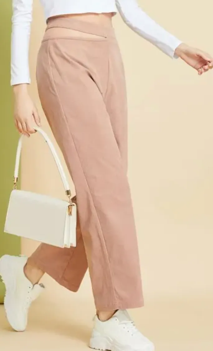
I care less about skirts and pants being lighter because they are further away from your face, so it doesn't really matter as long as they go with your top! I love denim and suede skirts, and some leather skirts too if they're the correct length! Silk is a great option for summer and spring; the quince silk skirts are a lot more affordable. I like more of my earthy colors to sit on the skirt/pant area so that I can play with colors more. Skirts are super nice because you can tuck the shirts in and layer nicely, even add a belt to bring the waistline in.
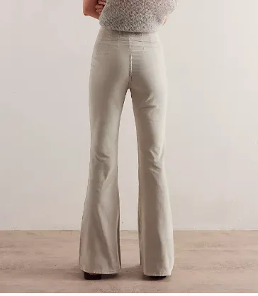
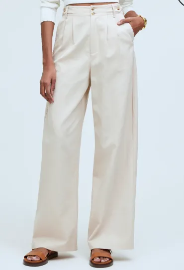
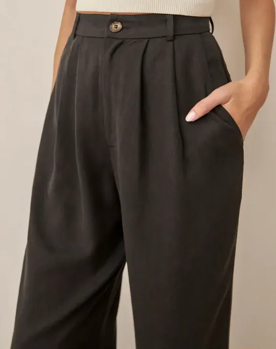
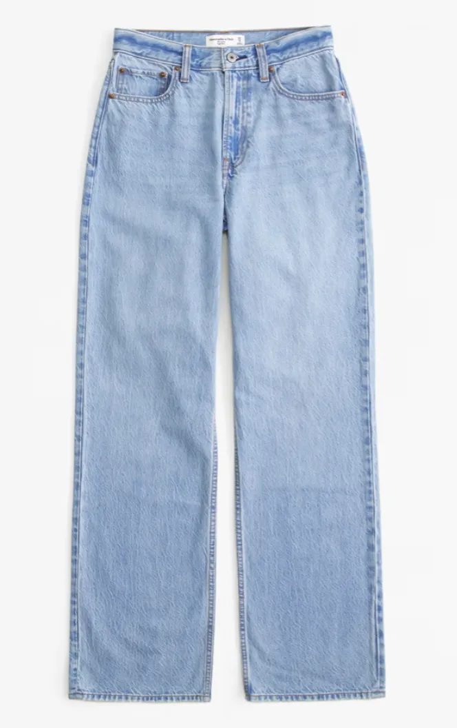
pants
The Madewell petite Harlow wide-leg pants are my go-to for work events. I own several pairs, and they are linen, so easy and light for traveling to hotter climates. The wide leg looks chic and professional. Abercrombie also carries extra short to extra long, which is super inclusive!
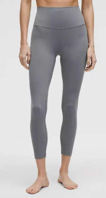
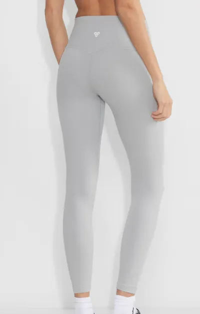
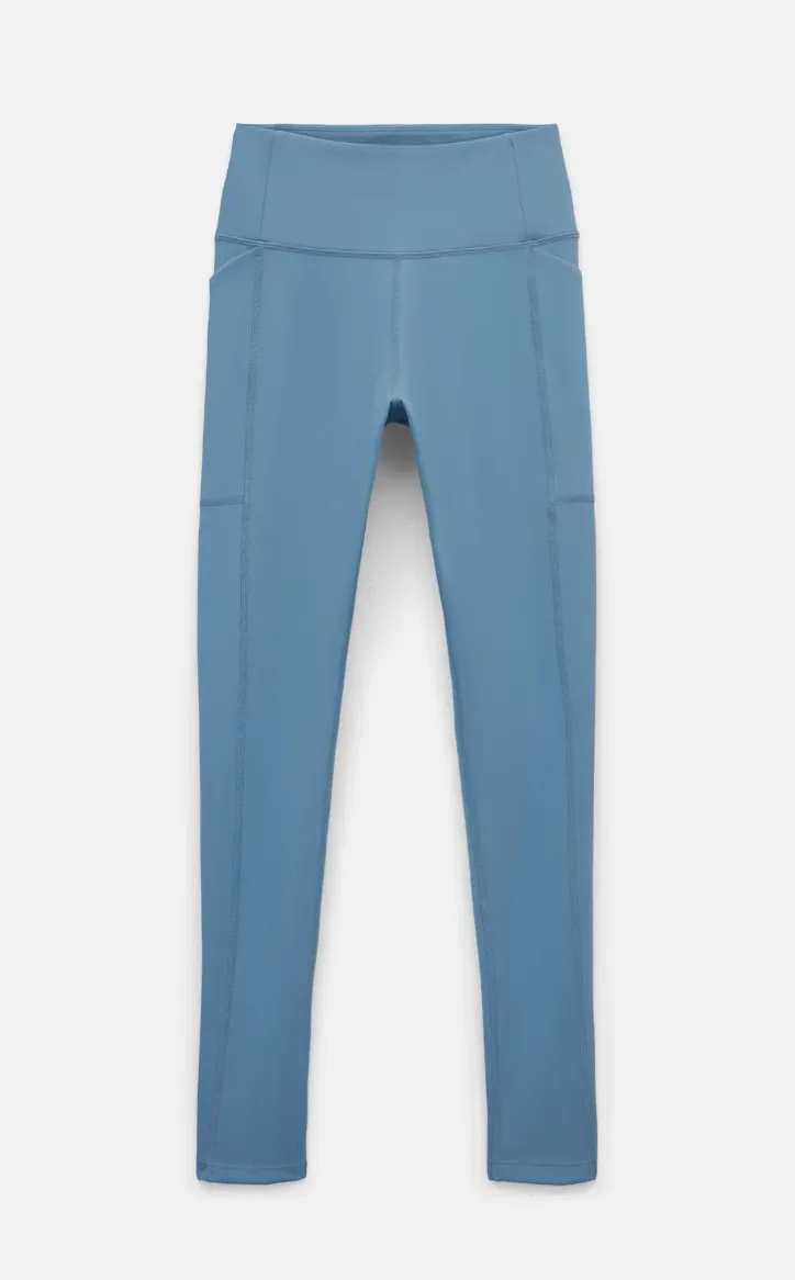
leggings
These matter a lot less to me since I don't care about the color season when I'm hiking or working out. If you have more incentive to be in your palette for that, then you can look into ways to make that work. Keep the tops (like above) light, soft, and muted, and they'll likely pair with most pants you have. I still love black leggings, and they're not going anywhere!
Understanding Kibbe Body Type and Style Essence
What actually matters when it comes down to looking good and feeling good in your clothes? This is something I am still figuring out and feel like I've improved. The first step is, of course, being healthy and eating clean (lots of veggies, plant-based protein, fruits, and less alcohol). I also run a lot, which I think everyone should try (or even a brisk walk) if their body doesn't have any injuries. You can determine your kibbe body type here, and that'll help you choose specific styles if you're stuck
Once you feel good about your health and body, it's easier to feel comfortable in clothing, but especially great in pieces that work for you.
final tips
- I use LLMs to help discern color temperature as well as style because, admittedly, I'm not great at this. Screenshot the colors, give them to ChatGPT, and ask which are in your palette. If there are colors outside your palette that you love, just find new ways to wear them and draw the colors away from your face, and you should be good! I also built StyleMeMama, a web app designed to help with styling and color analysis — use code somewherewithsora for free access (first 25 users only).
- Beyond just colors, it's also important to take into account your own body measurements and determine what lengths best suit you! For example, I have a short torso/long legs, and I love when skirts are just around 16 inches in length, then they hit at the right part of my legs and seem more elongated than if they're shorter than that.
Was this helpful? Share any other ideas with me and comment below!